debra vigna

12 Black + White Pendants to Knock Your Socks Off

Ah . . . the almighty pendant. Strong on its own, marvelous in a group, it plays well with others, serving its own purpose and distinction in a space already offering recessed or spot-lit sconce lighting. A single pendant in a bathroom can be surprisingly stunning, a series of pendants down a hallway is a solid middle finger to the tradition of modest, subtle flush-mount lighting, announcing “more is more, babe. live with it.” And because we’ve had a few clients over the years wonder about the vernacular of “pendant” versus ”chandelier,” here are the general contrasts between the two: while a pendant is a singular fixture hanging from a rod, cord, or chain, chandeliers are oftentimes hanging by a chain with a central body and varying branches extended from the main body; pendants can provide wonderful task lighting while chandeliers impart a more romantic glow (otherwise known as “mood lighting” rendering everyone’s skin flawless); there’s also a fairly strong price disparity between pendants and chandeliers, with pendants typically being less costly versus the larger dimensions, more expensive materials, and the cost of professional installation a big-ass, ornate chandelier can require.

Here’s a handful of pendant “rules” to play by:

1) In an entryway, a pendant should be hung approximately 7’ from the floor. (We’re not big fans of the word “should” in most contexts, but when you don’t want people walking into the bottom of a pendant light upon entering your home, I think “should” is appropriately used in guiding decision-making). Of course, if you’ve got a 30’ ceiling in your two-story foyer, the suggested 7’ guideline wouldn’t apply - in the grandiose, sweeping foyer scenario, we recommend splitting the vertical space into thirds and hanging the pendant 2/3 from the ground floor.

2) Over a dining table, the standard drop is anywhere from 28” - 36” between the bottom of the pendant and the dining table itself. Most common and a fairly safe guideline is to go with 30 inches. But if your ceilings are taller than 8 feet, you can easily keep 36” - 40” of space between the dining table and pendant and no one will rudely comment or quietly think you’re a weirdo.

3) Hanging multiple pendants over a kitchen island or dining table is a fabulous way to bring needed light into your space while also making a conscious design statement by way of the scale, shape, color, material, and style. Typically, they ought to be hung 24” - 30” apart from one another, so use that as a guideline to determine the number of pendants you’ll be hanging! ****For example, if your kitchen island is five feet long, two medium pendants (approximately 12”-16” diameter or thereabouts) should suffice. Find the island’s center point of 36” and hang the two beauts equidistant from one another (so let’s just say 15”- 18” each off the center point, depending upon if you want 30 or 36 inches of space between the pendants). Yes, it’s a bit of math, but mostly it’s math plus instinct (which I realize is more math) - the pendants need to relate to one another while not leaving too much unlit island on either side and not seeming mashed together like a codependent couple. Got it?

4) ALWAYS have dimmers connected to your pendants (and any hard-wired lighting in your kitchen, den, living room, TV room, library, or lounge, for that matter). It’s beyond worth the necessary additional costs during installation. Even if you want to save those extra bucks and you’re nearing your budget’s high-end or are over budget and having a meltdown, HAVE THOSE DIMMERS INSTALLED IN YOUR HOME’S COMMON AREAS. Not only will their addition monumentally improve the quality of your own life residing there, but dimmers increase the heck out of your home’s value, so it positively impacts your potential resale down the line. (You can thank us later.)

For awhile, it seemed like everyone and their second cousin twice removed had this IKEA pendant and I wouldn’t blame IKEA for never ever discontinuing the design because it’s GOOD (and less than $70, for heaven’s sake). We saw this dang pendant EVERYWHERE in Los Angeles and its common placement in restaurants, for example, belied its insanely low price point. The range of pendant designs is incredibly broad, from mid-century modern to bohemian to traditional, and the pricing is equally all over the place. The excellent news is this - you can get a DAMN FINE, sizable, beautiful pendant for less than $500 (and you don’t have to join the IKEA legions to do so).

More than half of the black and white pendants we’ve pulled together here fit that under-$500 niche - one is inspired by Japanese teapots, another inspired by an overturned water vessel, another made from two delicate tiers of bent bamboo slats (!!). In the realm of pendants, there’s certainly no shortage of Tom Dixon knock-offs, but we’re pretty much purists when it comes to George Nelson, and the older the better! For the purposes of this post, we’ve specifically opted for black and white pendants, but I’m 100% confident we can devote a future post to our favorite rattan, glass, and brass pendants, so stay tuned for a future pendant-love post!

127263.jpg
127684.jpg

SHAPERS / / MEG CRANSTON

Strolling through the massive Art Los Angeles Contemporary show earlier this year, we spotted (and Instagrammed) one of Meg Cranston's incredible dog portraits and we immediately knew we had to feature her in SHAPERS. Currently the chair of the Fine Arts Department at Otis College of Art and Design, her sculpture, paintings, and video/performance work have earned her international accolades and she's exhibited at the Museum of Contemporary Art, the Neuer Aachener Kunstverein, The Getty Museum of Art, The Hammer Museum, Museum Abteiberg, Mönchengladbach, The Carnegie Museum, K21 Museum, Dusseldorf, and the ICA, London, to name just a few.

Also, she has a super cute pooch named Jenkins and began a shelter dog photography project back in the mid-2000s, which ultimately helped to increase the number of dog adoptions, and we are always and forever 100% fans of that kind of altruism and creativity! 

Many,  many thanks to Meg for so intelligently and thoughtfully tackling this SHAPERS q+a! Enjoy!  

Can you tell us about your project photographing shelter dogs back in 2008? What was the experience like, what inspired the project, what was the endgame artistically or otherwise and how did it affect you/your work?

I was looking to get a dog and spending some time on the shelter websites. I decided to try to photograph all the dogs in LA shelters over a one month period. I tried to photograph them myself but quickly realized it isn't that easy to photograph a dog. So I partnered with the various shelters to get their photographs. That was a bit tricky because it involved working with the Chief of animal control. He was suspicious at first because he had to make sure I wasn't creating an expose on the shelters but then was happy to help. The most interesting thing was the quality of the photographs from different shelters varied a lot. At one shelter, the worker taking the photographs was careful to "art direct" the images. He posed the dogs in green settings even with some fake flowers arranged. He had the dogs standing in action poses so they looked lively and happy.

Compared to other shelters ,were the dogs were photographed in cages or on leashes, those animals looked highly adoptable. That shelter in fact did have higher rates of adoptions.

Because people primarily look at shelter dogs on websites, being photogenic is a life or death issue. 

The paintings I did of the shelter dogs takes that a bit further. Historically there are many dogs in paintings though typically they are high status dogs - hunting dogs or pets of wealthy people. The paintings of George Stubbs would be an example. I decided to do rather monumental portraits of ordinary dogs - shelter dogs who would not typically be painted.

Meg Cranston, "Corgi," 2014. 

Meg Cranston, "Corgi," 2014. 


Meg + Jenkins. 

Meg + Jenkins. 

What's your favorite thing about living in California?
I like the attitude of people in California. Theyhave a relaxed confidence that's easy to be around. The artists in Los Angeles aren't freighted with a lot of rules. They do whatever they want. Europeans especially admire that. 


How does teaching art influence your own artwork?
Besides paying the bills? I love teaching because in my courses, I have to write lectures about new topics all the time. If I didn't teach I doubt I would read as much or stay as current. Also there is a part of me that's a performer. Giving lectures is a kind of performance. It's fun. Of course the students are all fantastic. I have said many times, I have never had a bad student.

Art students are the best and most interesting students one can teach.

Meg Cranston, "Poodle Mix," Installation view, Michael Janssen, Berlin, 2014

Meg Cranston, "Poodle Mix," Installation view, Michael Janssen, Berlin, 2014


Which decade resonates most poignantly with you - 1960s, 1970s, or 1980s? I admire art of the 1960's for its clarity and optimism, art of the 1970's for its intellectual rigor, art of the 1980's for its focus on recasting artistic values as political. 


Meg Cranston's "California" and "Fireplace 12" at the Hammer Museum for Made in L.A., 2012.

Meg Cranston's "California" and "Fireplace 12" at the Hammer Museum for Made in L.A., 2012.


The scariest thing you've ever done?
I do stand up comedy. That's pretty scary especially for the audience.


Are you a morning person or a night owl?
I am a night owl who has to get up at 6am. It's a dilemma.


Name three of your favorite sculptors/3-dimensional artists and use a single word to describe each.

Alberto Giacometti  -  armature
Brancusi  -   base
Franz West  -  scale


What books are currently on your bedside table?
Grand Hotel Abyss: The Lives of the Frankfurt School


*Lily Spindle’s SHAPERS profiles the people whom we consider to be remarkable movers and shakers, doers and dreamers, trailblazers and big thinkers, the people who are doing things a little bit differently and unconventionally, with immense heart, passion, and authenticity in what they do. Artists, designers, writers, philanthropists, iconoclasts, artisans, heroines, voyagers, and all kinds of extraordinary extraordinaires will be interviewed in our SHAPERS series.

Is your house holiday-ready?

It's barely Halloween and while the Fright Night masks are still on the shelves, retailers are stocking their spaces with holiday baubles, garlands, glass ornaments, and fake wreaths. It may seem crazy to launch the countdown to the holiday festivities so soon, but the celebrating, cooking, and partying of the the last few months of the year begins pretty much NOW and there's nothing like the occasion of entertaining friends and family (and co-workers, in-laws, neighbors, et al) to make you wonder aloud, perhaps gripped with a wave of coinciding panic, "IS MY HOUSE HOLIDAY-READY?"

Never fear, my dears!

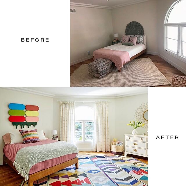
Deb and I were talking the other day about how often we operate under tight deadlines with clients for one reason or another - surprise birthday party, cast and crew party, fundraising event, and the list goes on. We LOVE helping people get their homes together to not only feel like a place THEY love to be, but also a place they're proud to share with others. And sometimes all it takes is an outside well-practiced, creative perspective to bring your space to a more gorgeous place -- whether it involves additions or omissions or shifting the awesome things you already own (usually a combination of all three!), we Lily Spindle ladies thrive in the art of reinvigorating everything from a teeny room to an entire home. 

Case in point, for many months our friend Heather had been hunting for a rug to bring together her living room. So after a few conversations with her, Deb and I immediately hopped to it and scored her an awesome deep pink and apricot striped Turkish 5' x 8' rug (having told her we thought that Amalfi/Venetian pink was the right vibe).  The rug arrived within five days, she got herself the rug pad, and Heather was entirely stoked with the result. This is what she had to say about our work: "You two birds helped me conquer my carpet block within 24 hours! Your expert eyes quickly honed in on just the right textures and colors and I love my joyous living room even more now." Check it out below...

Heather's Noguchi coffee table and Eames molded plywood chairs are now fabulously moored by the colorful Turkish rug we discovered..

Heather's Noguchi coffee table and Eames molded plywood chairs are now fabulously moored by the colorful Turkish rug we discovered..


This Franklin Hills patio with an incredible view was staged and ready to roll for our client's cast and crew party and, come evening, the summer air and flickering candlelight completed the cozy scene. 

This Franklin Hills patio with an incredible view was staged and ready to roll for our client's cast and crew party and, come evening, the summer air and flickering candlelight completed the cozy scene. 


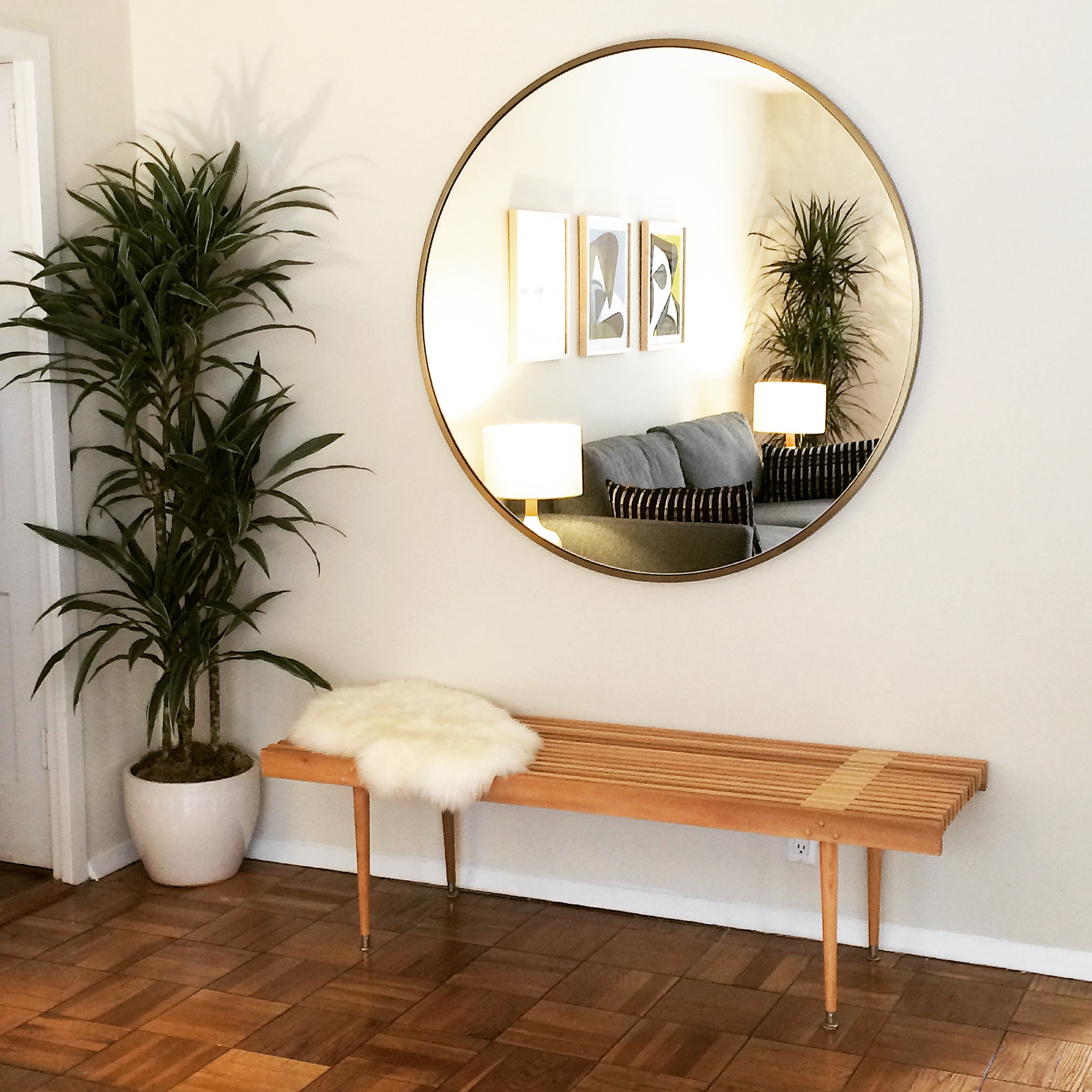
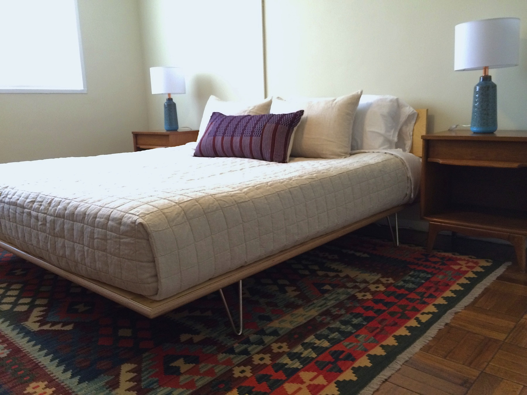
We also just wrapped up a project that took three and a half weeks from start to finish. Lily Spindle outfitted our client for an entirely new space, starting 100% from scratch and sourcing every single thing for his pied a terre from doormats to dining chairs and pretty much every conceivable thing in between! *Not-so-great iPhone snaps shown below! 


And so, DON'T FRET ABOUT THE IMMINENT HOLIDAY PARTIES + DINNERS, ok? Lily Spindle is at your service with our years of design experience. 

Need a new sofa?
Done.

Need an oversized vintage mirror in the alcove?
Copy that.

In need of an original painting?
Check.

Not even quite sure what it is that you need?
No worries! We'll sort it for you/with you/on your behalf. 

xx ~ Rebecca + Deb