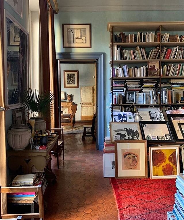
Beginning a relationship with an interior designer or architect can be a bit like dating. There’s a particular vibe you get from the other person and you innately determine whether or not you want to see them again. And then again. And then again and again.
Well, let’s be realistic. It’s actually way more complicated than dating.
Way.
More.
Complicated.
Fold in the intimacies and private nature of your home and its residents, its possessions, its pets, your lifestyle, your predetermined and sometimes latently truculent beliefs about the kind of home you *think* you want and the path to arrive there. Then fold in the potential for a proprietary claim on the space you, deep in the recesses of your soul really do want changed. Then fold in the psychology of trust, money, and a healthy dose of fear. And, yes, without a single doubt, this venture has the very real capacity to be significantly more complex than mere dinners, movies, cocktails, and whatever else falls into the broad category of modern “dating.”
The past year has brought a lot of first-timers to the interior design realm, particularly after a year of really getting to know (read: forced to become extremely familiar with) the interiors of their homes, as well as some first-timers who’ve bought new homes and need an expert eye straightaway.
With the proliferation of first-timers who may be nervously entering the interior design or architect process and relationship (because while it may not be dating, it is indeed a relationship!), we thought we’d consult with some of our favorite esteemed designers and architects for their wisdom, and throw in a bit of our own advice for the nervous newbies for good measure!
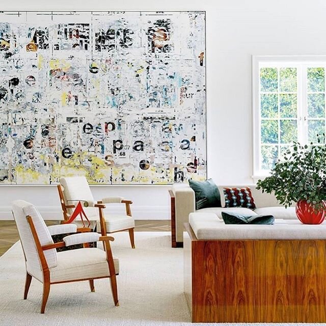
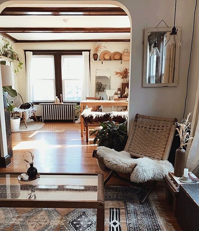
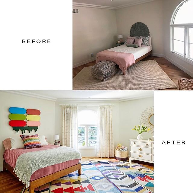
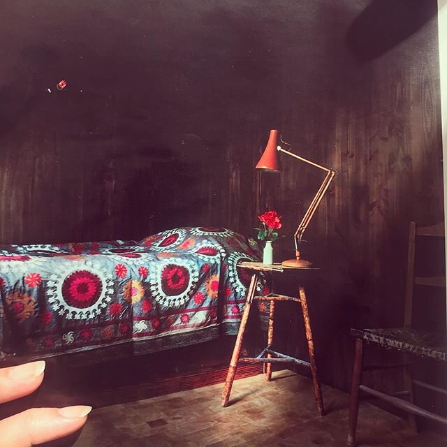
Design by Lily Spindle, photo by Michele Thomas
1) “Always do your research.”
Kirsten Blazek, the wildly talented mastermind behind a1000xbetter, an interior design and home staging company launched in 2014 who now offers online virtual design in addition to commercial and residential design (as well as real estate staging!), points out it’s best to calm your nerves by doing your due diligence beforehand.
"Always do your research. Find a designer that aligns with YOU as a person and your aesthetic. Anything having to do with your home is an intimate process. You're involved in each other's lives for a long time so make sure you vibe and the connection is organic. I think asking a lot of questions is always beneficial. You'll navigate things a lot smoother with transparency. Lastly, be open.”
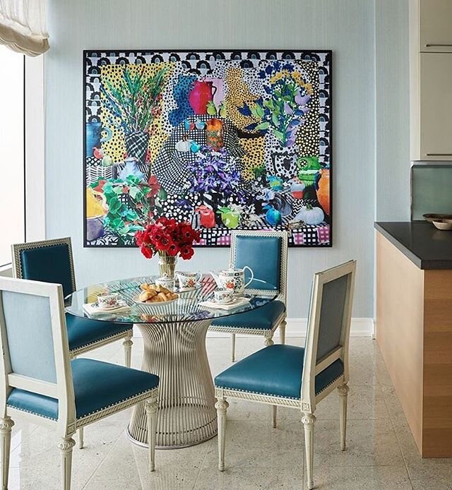
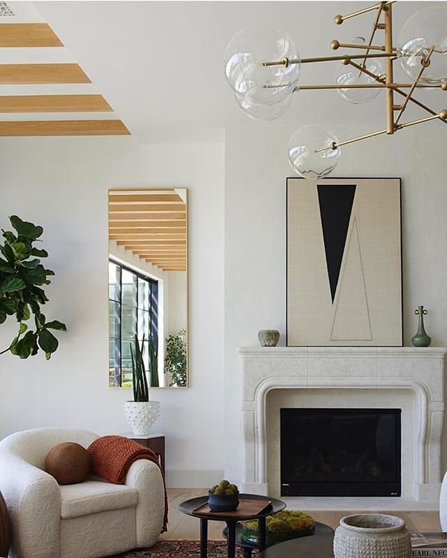
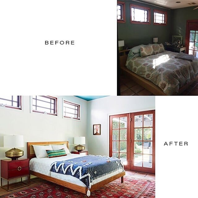
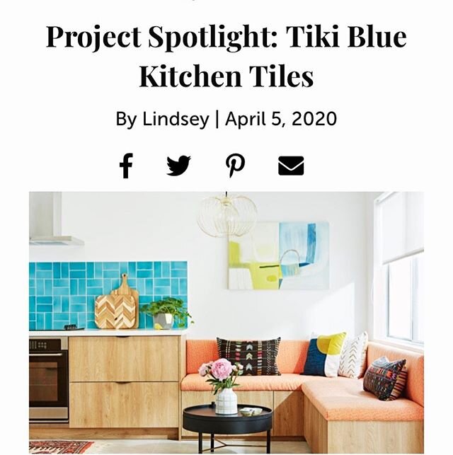
Design by a1000xbetter
2) “Establish a preliminary budget range.”
Blazek emphatically states “Establish a budget from the start!!! Make sure you can afford the designers you meet with. Money can be a sore subject and our goal is to work within the clients' means.” She’s right to add all those exclamation points because while money can seem sort of nebulous and loose at the start, it’s certainly not nebulous once the invoices begin to roll in.
Su Addison and Jefferson Schierbeek, the duo who make the Addison Schierbeek architecture firm everything that it is – intuitive, collaborative, and downright brilliant – say, “when embarking on the adventure of a remodel or construction of a new home, be prepared to ask a lot of questions about the process and answer a lot of questions about yourself. Start with a little soul-searching and consider what you want. Establish a preliminary budget range for the project and desired timeframe.”
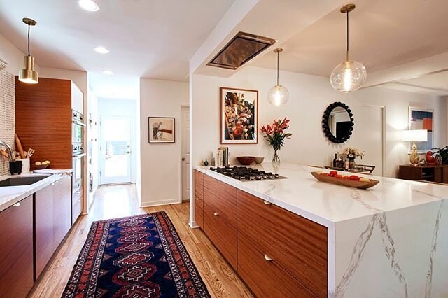
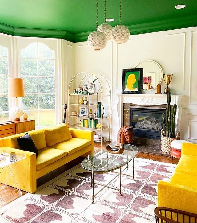
Design by Addison Schierbeek. photo by Michele Thomas
“Break the habit of looking at a room piece by piece, and definitely stop looking at the budget that way, too,” says Patrick J. Hamilton of Manhattan-based Patrick James Hamilton Designs. “I’ve had clients say, ‘Oh, I’d never spend that much on a lamp!’ even though they absolutely loved it. But if you look at the room, and its budget, in totality, your designer can make that lamp work, and still bring you in at or under budget.” An interior designer, blogger, and writer, who’s clever, talented, hilarious, and whose work is beyond elegant, Hamilton’s perspective has been honed by over a decade’s worth of residential projects in New York and his brilliant advice for the first-timers hit home with us.
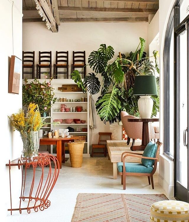
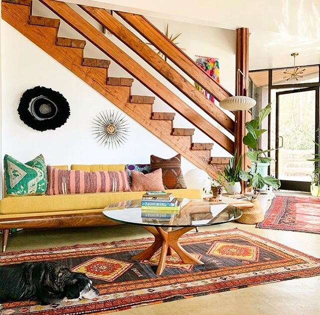
Design by Patrick James Hamilton Designs, photo by Jody Kivot
3) “It’s a process that will seem longer than you’re expecting.”
Thanks to the miracles of television production and editing, it seems like on a budget of eight dollars, two tubes of Superglue, and 72 hours, intrepid designers can create a new bathroom/kitchen/ADU. Sorry, y’all. Even the best of us are stymied by those parameters. The interior design process is indeed a process – it’s not immediate and it can’t quite be rushed, unless you’re prepared for results that could very well feel disjointed and fragmentary.
As Hamilton says, “Be prepared for an organic process, and a process that will seem longer than you’re expecting. It’s definitely not ‘as seen on TV.’ Respect the process. We all work a little bit differently, but we all have our own tried-and-true process for getting to a fully finished room. The early days of the project may seem slow, but that’s when the groundwork is really being laid.”
Carly Callahan, owner and head designer at Callahan Interiors, based in Chicago, brings straight talk to the table on this bit of advice: “Expect hiccups. No project runs smoothly from start to finish . . . Be prepared for an issue (or five) to arise and be open to solving them together with your designer. It could be that a fabric that you love is discontinued, the perfect slab for your countertop broke in transit, or the wood floor stain came out totally different than the sample you selected.” Callahan, whose interiors are predominantly bright and fresh, with soft, nuanced hues throughout continues, “Sometimes this results in what I call “happy accidents” and can even end up being the best part of a project.”
Design by Carly Callahan
4) “Trust your designer.”
We fully understand that your home is, for all intents and purposes, not just your haven but an extension of yourself, so when bringing interior designers into your space triggers the specters of territoriality to emerge, we aren’t exactly surprised. But, as George Michael used to say, you gotta have faith. We see things you don’t see, we see a wider, more aerial, holistic perspective and the myriad possibilities of beauty.
“It’s definitely a process of learning to trust your designer,” says Hamilton. “The earlier you jump in with the trust, the better the outcome will be. We have incredible visualization skills. It always makes me laugh when a client says, “I just can’t see that” as a reason to shoot something down. Well, I can. That’s what you’re paying me for.”
Blazek agrees: “It's hard for people to fully trust in a designer, but usually the best work comes from that trust.” And Callahan echoes that sentiment: “This is what we do for a living and our goal is to make you happy. We can achieve the best results when we have a client that trusts our vision and expertise so it's truly in your best interest to find someone you can put that trust into.”
Design by a1000xbetter
5) “Let them take you beyond your comfort zone.”
“Be realistic about what leaps of faith you’re ready to take,” says Hamilton. “I worked with a first-time client who said that she was really ready to reinvent the space (after a flood in an adjacent apartment gave her insurance money for a whole-apartment renovation). It turned out she wasn’t, and slowly but surely, the whole thing eroded back to exactly what she started with, right back to the comfort zone of how she lived for the previous 20 years. It made us both frustrated, we wasted a LOT of time, I lost money, and she surely did not get her money’s worth out of the relationship.
Is this another way of saying “trust is crucial”? Perhaps. But how can you, as a first-time client, end up with a space you’ve never been able to quite imagine but one that you absolutely love? You’ve got to trust the interior designer and/or architect ultimately aims to get you there. That’s our mission. None of us want to recreate what you already have and keep you locked into a space that initially made you reach out to us in the desires for much-needed change to begin with. Bringing you back to where you started is NOT our goal. Where’s the joy in that experience? Where’s the fulfillment in that big reveal?
Design by Carly Callahan
“Understand that a project evolves throughout the process and can transcend all expectations when there is a strong collaboration between you and your architectural team,” adds Addison/Schierbeek. And that word – “evolves” – is crucial to recognize. Evolution is not about staying where you began – it’s about thriving, developing into something new, something unexpected. Let your designer bring you there! It’s a good place to be.
6) “Work your YES muscle.”
We’ll add this final tip: while the interior designer/client relationship involves compulsory trust in order to make the creative venture a truly successful one, and a predisposed love for the designers’ work is also vital, the interior design experience is an excellent opportunity to work your “YES” muscle. The “NO” muscle can be Herculean in certain respects and some first-time clients have that “NO” muscle bulging and glistening, doing “NO” reps - curtly declining palette proposals, rugs, tiles, sofa styles, upholstery options, kitchen and bath layouts, floor materials, you-name-it. Those laconic NOs don’t help us, as designers, get any client any closer to where they could be. We’ve had more than a few clients tell us “I don’t know what I like, but I know what I don’t like.” With that, there’s a seemingly infinite number of things someone could reject, for a seemingly infinite number of mysterious reasons (sometimes reasons are, in fact, shared and that clarity is actually rather helpful: “I don’t like Lucite because it reminds me of my grandparents’ house in London.” OK. Noted. Also, true story.)
Design by Lily Spindle, photo by Michele Thomas
Interior designers, even those of us who’ve been in the business for years, cannot topple a craggy NO mountain. There aren’t enough design service hours in the universe. We’d suggest that first-timers work that YES muscle, because NO has been working overtime at the late night gym while YES has atrophied. Find something you like. A style of leg on a dining table, a particular fabric sheen, the proportions of a mid-century modern coffee table – just say YES. Because it gets easier and more empowering every time you say it, and your confidence in what you do like will only expand, which will, in turn, impact the final outcome of the project as much as it will impact the conditions of the countless roads we take to arrive there.


