Lily Spindle's Best of : Our Top Swivels

There’s a moment when you sit in a gorgeous upholstered chair, whether it’s in a showroom on La Brea or an antique shop in Pasadena, and you begin to feel the chair turning ever so slightly and it’s that moment of joy in which you recognize “Oh my goodnessss, this is a SWIVEL!”

Maybe that’s just us?

But we’ve got to admit it happens in the same way nearly every time when it’s such an unexpected and delightful surprise, as Lily Spindle's love of swivels runs deep. They’re magnificently utilitarian while being, typically, a shape and proportion that complements every interior style, architecture, and décor. They’re amazing to curl up in with a good Sally Rooney book and a cup of chamomile tea on a gloomy afternoon. They’re fabulous for parties since you can swivel towards or away from whomever you want. And what better way to have a group viewing of “Dirty Dancing” for Patrick Swayze appreciation week? That’s not a thing, but it really ought to be, because he was pure magic.

While putting together this list of our top recommended swivels, we discovered some facts we may perhaps have been the last to know, but just in case we’re not, we’ll share them with you! In 1775, a year prior to the Declaration of Independence being drafted, the traditional seating was the Windsor chair, which was solid wood with a tall back and zero mobility. Thomas Jefferson, crafty inventor that he was, ingeniously added an iron spindle to the bottom side of the Windsor chair, replacing the original legs with bamboo, and also attaching a writing paddle to the chair’s arm. Allegedly, this wonderfully mobile creation is where Jefferson sat while drafting the Declaration of Independence. This particular chair has been in the possession of the American Philosophical Society in Philadelphia since 1836. Cool, right? 

The swivel chair has certainly evolved in countless ways since then, of course – the ingenuity of the swiveling desk chair being applied to living room lounge seating and the result referred to as tub chairs or barrel chairs (though not all tub or barrels are swivels, to be clear), spinnies, or, simply and succinctly, swivels. No matter what they’re called, we love these chairs with an endless fervor and adore integrating them into our clients’ spaces.

And here you have it - Lily Spindle’s top 6 swivels, varying in price, design, style, and materials, but all of which have a timeless sensibility and classic sexiness to their individual vibes and design! Enjoy.


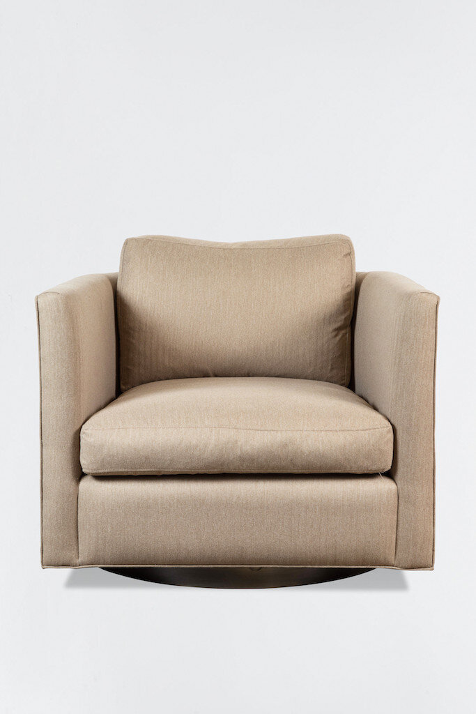
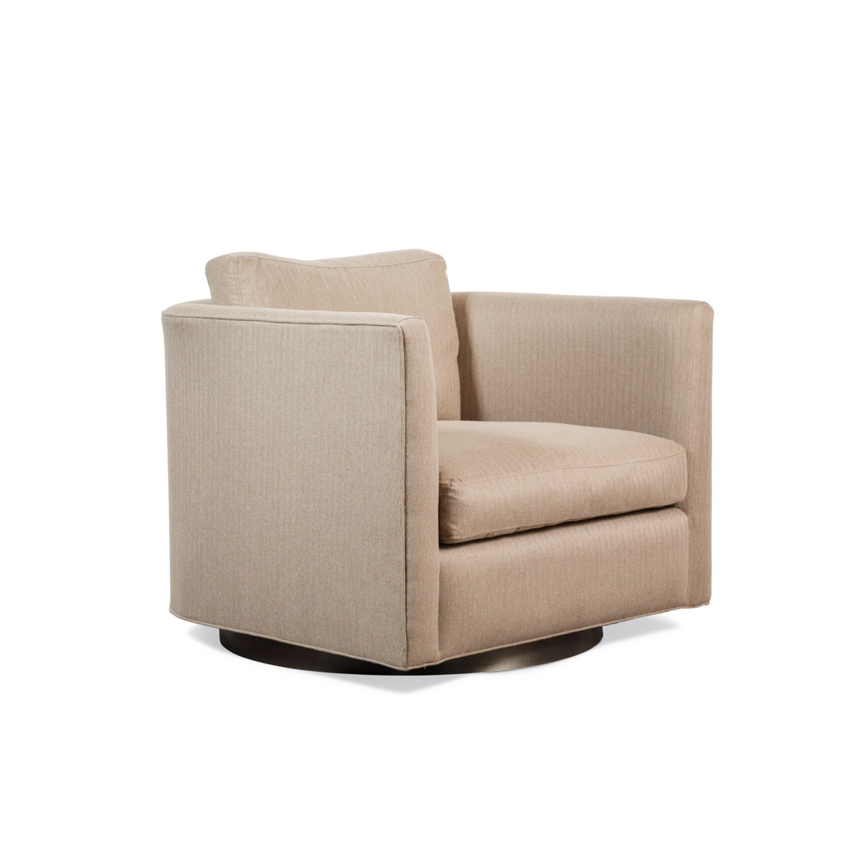
The Curved Back Swivel – Lawson Fenning

Tuxedo-style swivel chair with a subtly curved back (hence its name), featuring down-wrapped seat and back cushions and a metal or walnut base. Measures 34”w x 37”d x 31”high and, for what it’s worth, its sofa sibling version is JUST as sexy! Leathers and fabrics for the Curved Back Swivel are available via Lawson Fenning’s selection or you can go COM route (= Customer’s Own Materials = you’re welcome to separately choose and purchase your own upholstery and supply the required yardage to Lawson Fenning for production.) Pricing is variable, in the sense that COM pricing is $2450, Grade A fabric pricing is $3050 and Grade D is $4450.

The Fitz Swivel – CB2


Channel back makes all views and angles of the Fitz a designer’s dream, since swivels often times occupy a space where all sides of the furniture are, at some point or another, visible! Elegant, sophisticated, and sexy as heck, the Fitz is priced at $1299 and is available in two velvets – Russet or Luca (shown here in Russet); Measures 38.5” wide x 32.5” deep x just 27.5” high, making it one of the shorter swivels on our list, which is particularly ideal for keeping your room’s airy, lofty, open vibe going strong.

The Rotunda – Burke Décor


The thick, round oak base is a dominant feature of the Rotunda’s design, and the angled back and sides of the chair, sloping downwards from the seat, which projects ever-so-expertly from the profile, lends it an even more sophisticated vibe. These might be the perfect swivels to lounge in while listening to Sigur Ros and sipping scotch. Available in two cotton velvet colorways (Ivy or Stone, shown in the latter), priced at $933.80, measuring 33.5” wide x 29.5” deep x 29.75” high.

Otis Swivel – Room and Board


Described by Room and Board as the “modern version of the classic tub chair,” the Otis may not be a deep, lounge-y, “you’re gonna accidentally fall asleep in it” kind of swivel chair, but it definitely is a compact, minimalist, beautiful swivel chair design. And for spaces that aren’t massive (and swivels do need enough room to be able to, well, SWIVEL), they’re your best infallible bet, coming in at 32” wide x 31” deep (with a seat depth of 23”) x 29” high. Priced at $899 in Banks Rust or Vance Mustard (shown in latter) – both solid, stain-resistant and stain-repellent velvets; also available in over 200 different Room and Board fabrics with varying prices and leadtimes.

Crescent Swivel Chair – West Elm


We must admit, we were initially dubious about this swivel design for use in a  client’s home, but once we saw the piece in person, we were hooked! The diminutive scale (30” wide x 31” deep x 29” high) doesn’t overwhelm a room, so a single Crescent works well as an accent chair, and the rounded seat cushion paired with the tight back gives it a modern, fresh vibe. And, you know – you can’t beat the price - available in Basket Slub Horseradish or Feather Gray, starting at $599, with 39 other fabric upholstery options available. Stocked in two leather options (Nut and Smoke), priced at $1099; available in many leathers and vegan leathers for $1099 and $699, respectively.

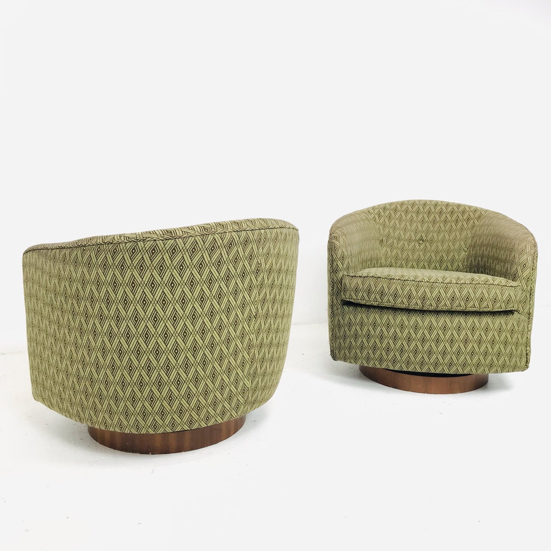
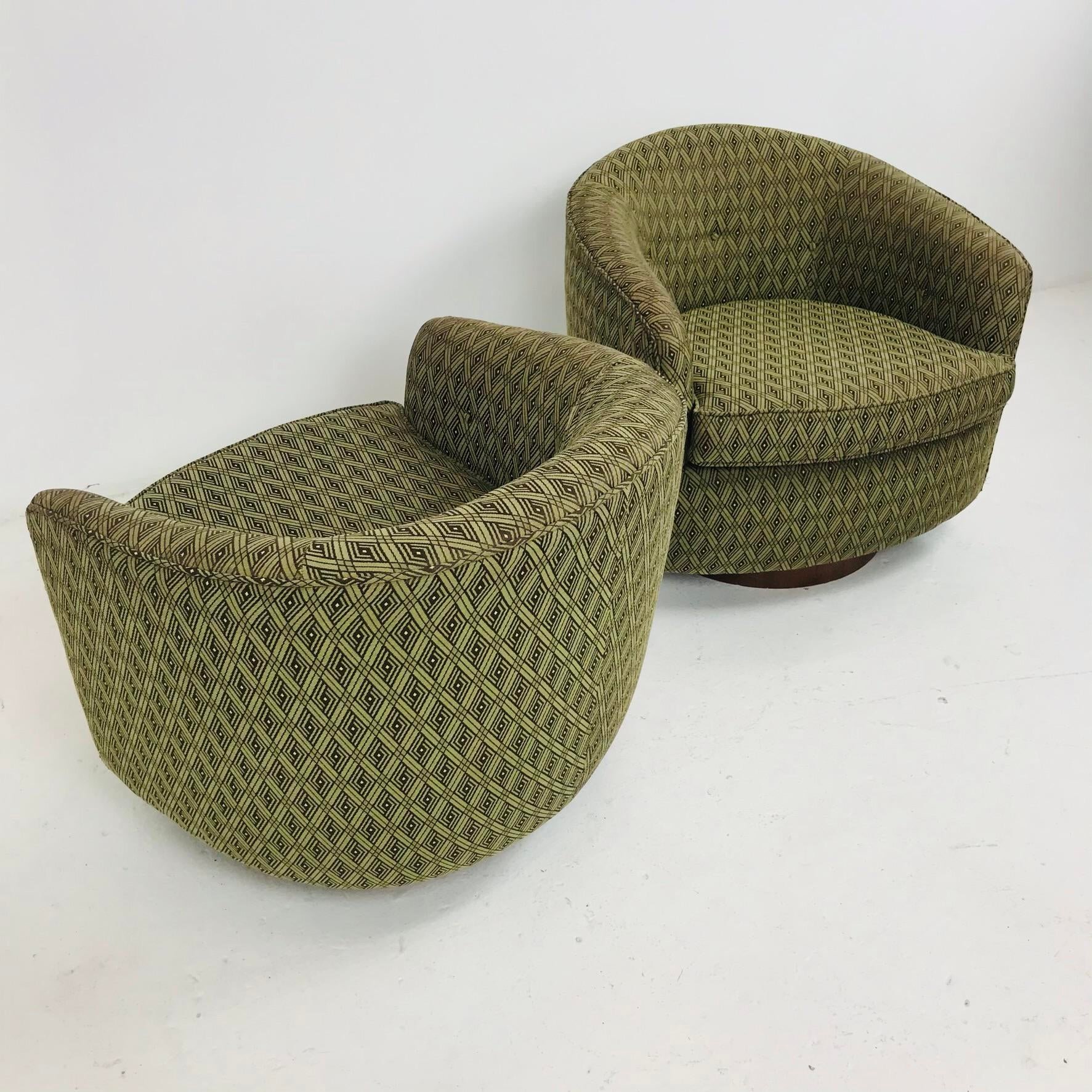
Milo Baughman Swivels

The king of the swivels might be Milo Baughman, a furniture designer who firmly believed furniture should look good from both the back and the front. His swivel styles vary throughout the years, as he was designing them from approximately 1950-1979, and collaborating with the likes of Thayer Coggin. This style in particular is likely circa 1970 (and we’ve seen comparable priced at upwards of $10k, for what it’s worth!) and is, in our opinion, the classic, streamlined swivel all others strive to be. If imitation is the highest form of flattery, the Milo Baughman swivel design is abound in enough compliments to last an eternity. (PS - these were at the fabulous shop Again & Again in Dallas, Texas and have already sold, of course!)

Lily Spindle's Top Six Sheets

It feels like most people forget their bedding. They collapse into it, exhausted, drool on it all night, and leave it tucked or disheveled all day, climbing back into it at the day’s end, likely not giving it much thought. While other elements of their home might be intensely considered - the Main Bath vanity pulls replaced, the upgrade of their kitchen faucet to a hands-free version (uh, worth it, by the way!), and all their glass windows cleaned to sparkle in those sunny, warm seasons, they may not ever really take a good look at their bedding and wonder if it’s time to switch things up. Specifically, we’re talkin’ about their sheets.  

Are you, maybe, possibly, one of those people?

If so, we ARE NOT judging, however, this post sharing OUR 6 FAVORITE SHEETS is maybe, possibly, going to change your life. 

When we’re improving our clients’ bedrooms, invariably we’re introducing not just top of bed elements like quilts or duvet covers, decorative pillows of varying textiles, colors, and sizes, and the requisite blanket or throw strewn or folded at the foot of the bed, but replacing the sheets, as well (and usually the sleeping pillows, too, because those bad boys are often times flaccid and pathetic, but that’s a whole other subject for a whole other post).  Whether it’s a newly papered wall or replacing appliances, installing new light fixtures, or switching out some of the bedding, once a new, beautiful thing is introduced, it’s an unfortunate but inevitable reality that the pre-existing pieces and spaces adjacent to this thing of beauty need to be addressed. It’s just the way it is.  

Every bedroom is unique, of course, but we have six tried-and-true sheets we adore and who’ve never let us (or our clients) down, no matter the bedroom’s style. We should note that flannel and microfiber sheets are not on this list, likely because we live and work in Southern California so flannel + microfiber sheets don’t often get a lot of inclusion in our bedrooms (additionally, just the word “microfiber” itself makes one of our founders shudder given its synthetic connotations and she’s pretty staunch about her bias, but, hey, minds are meant to be opened, if anyone wants to convince her otherwise!) 

Alright, here you go … Lily Spindle’s top 6 sheets, varying in price, design, style, and materials! Enjoy.


SDH Linen's Classic Legna Sheets
SDH_Legna_Classicbed.jpeg

Made of what feels and drapes exactly like silk but is actually wood fiber (just trust us! It’s absolutely exquisite!), Legna sheets are a total DREAM. They’re the sophisticated, stately version of satin sheets, in our opinion, and they are a total game-changer. Every client we’ve turned them onto says “WOW. Just WOW.” Woven in Italy, you can easily machine-wash them with a gentle detergent in warm water, and they’re available as top and fitted sheets, as well as cases, shams, and duvets, offered in a vast array of colors: Cappuccino, Cloud, Clay, Cobalt, Ecru, Flax, Glacier, Mushroom, Parchment, Sand, Shark, Silver, and Smoke.

Linen Studio RG

Married business owners sharing a love of French and Belgian linen, Rob and Dora’s Linen Studio RG, based in New Jersey, has been our reliable, beautiful, classic linen sheeting go-to for years now. They only use 100% pure linen and create all of their custom-made sheets (and pillowcases, duvets, and bedskirts, of course) in classic, timeless colors (such as white, oyster-white, natural flax, storm-grey, pale pink, and a wonderful natural grey stripe, to name a few)– that go with EV.ER. RY. THING.

Sferra’s Celeste Sheets
 
Sferra Celeste - FIONA_STACK_S2018.jpeg
 

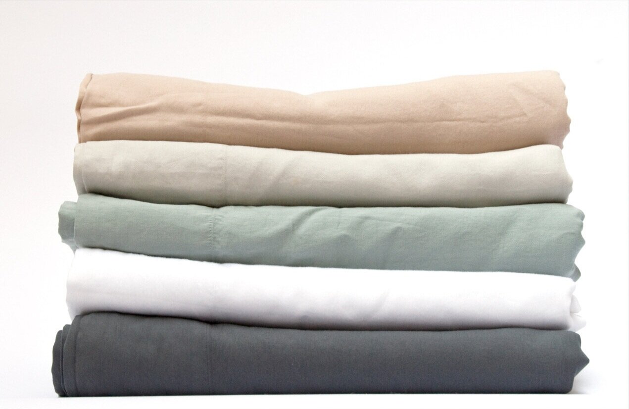
Woven in Italy, made of Egyptian cotton, 406-thread count percale sheets, Celeste sheets by Sferra immediately feel fresh and comfortable, like you’ve owned them forever and your dedicated use has given them that indescribably soft cotton feel not unlike a favorite button-down shirt worn to perfection. But make no mistake, these sheets are innately and endlessly refined and graceful, featuring single hemstitching along its edges and available in a wide array of pastel-ish hues such as white, ivory, aquamarine, blue, tin, grey, silver sage, ice, and mushroom.

Indian Fabrics by Suzie

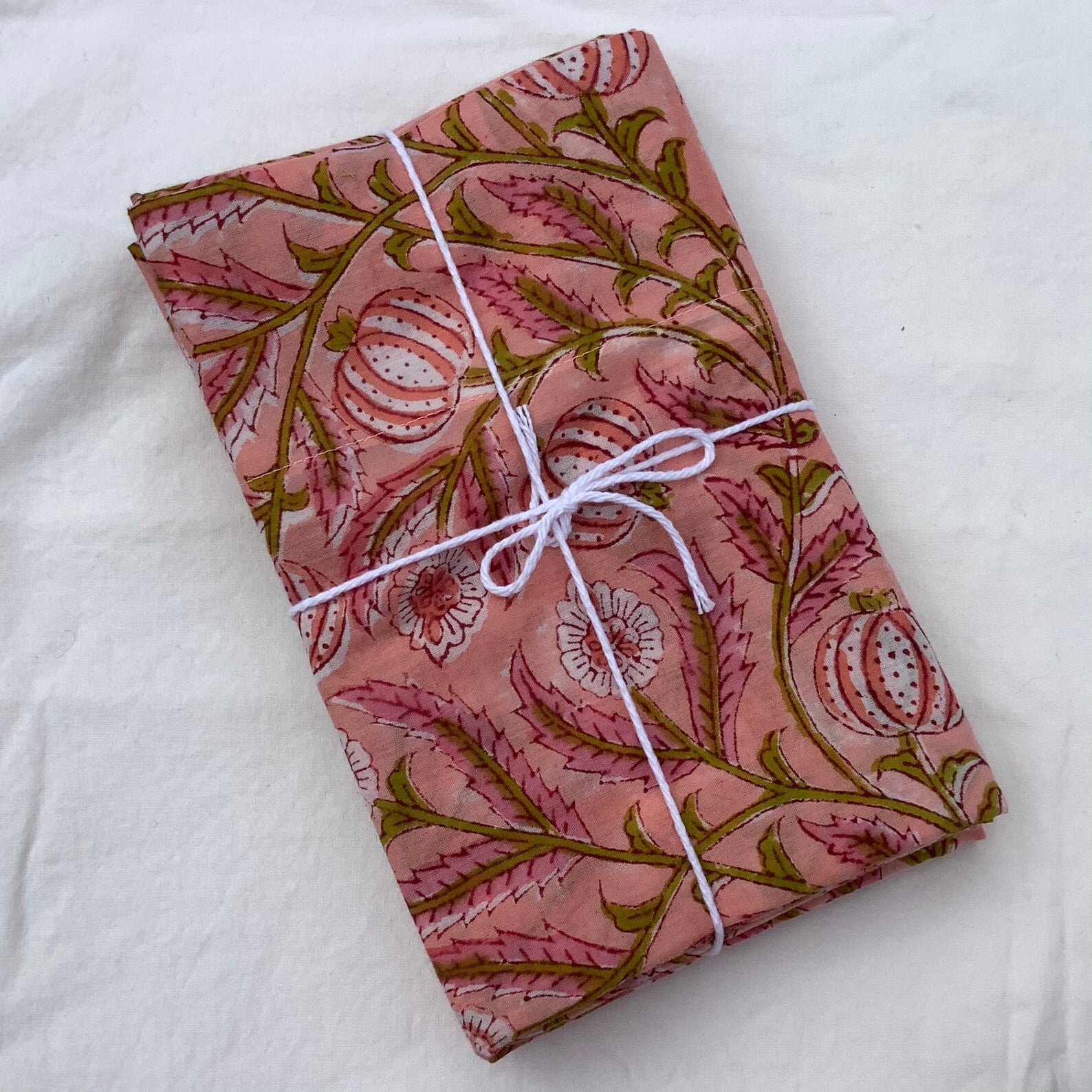
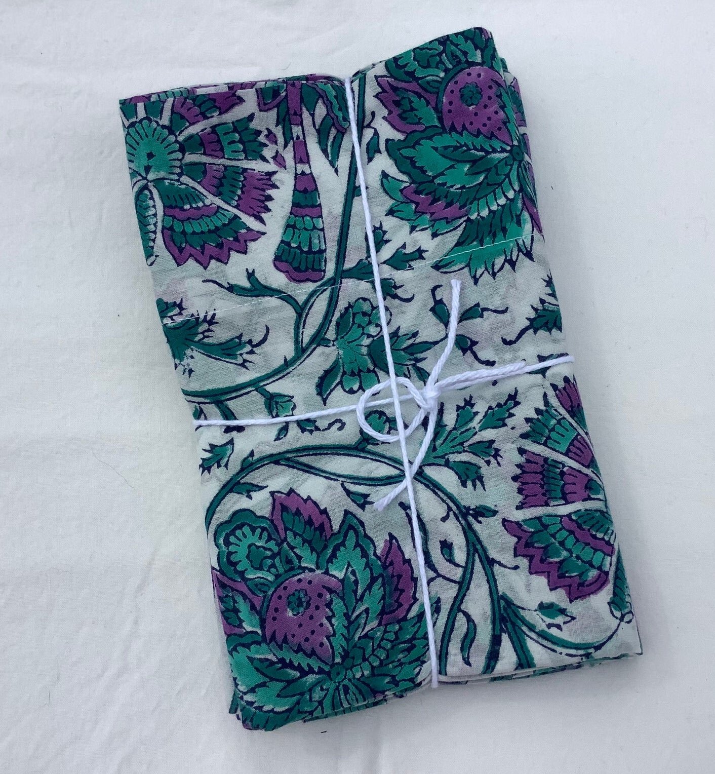
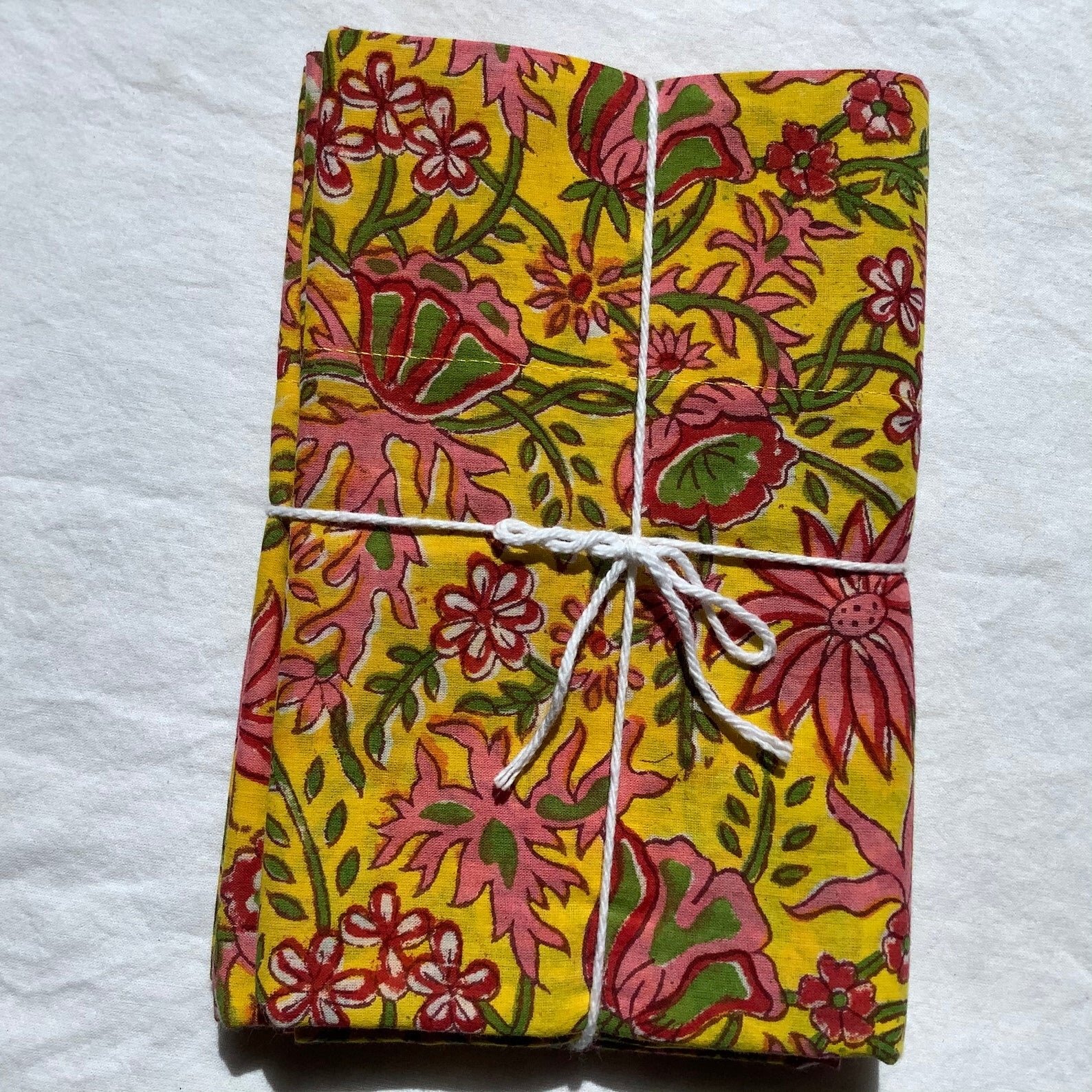
While she doesn’t create sheets, she does create pillowcases (really wonderful, lovely, charming, indescribably soft pillowcases), so we felt we needed to include Indian Fabrics by Suzie in our recommendations! Located in Sebastopol, California, this woman-owned business imports beautiful, predominantly vintage, Indian cotton fabrics directly from her artisan connections in India. The result is a small but fantastic collection of one-of-a-kind pillowcases in outstanding patterns and colors. (Bonus: they wash up like a dream, starting soft, but somehow progressively getting even softer with each wash!)

AREA's Perla

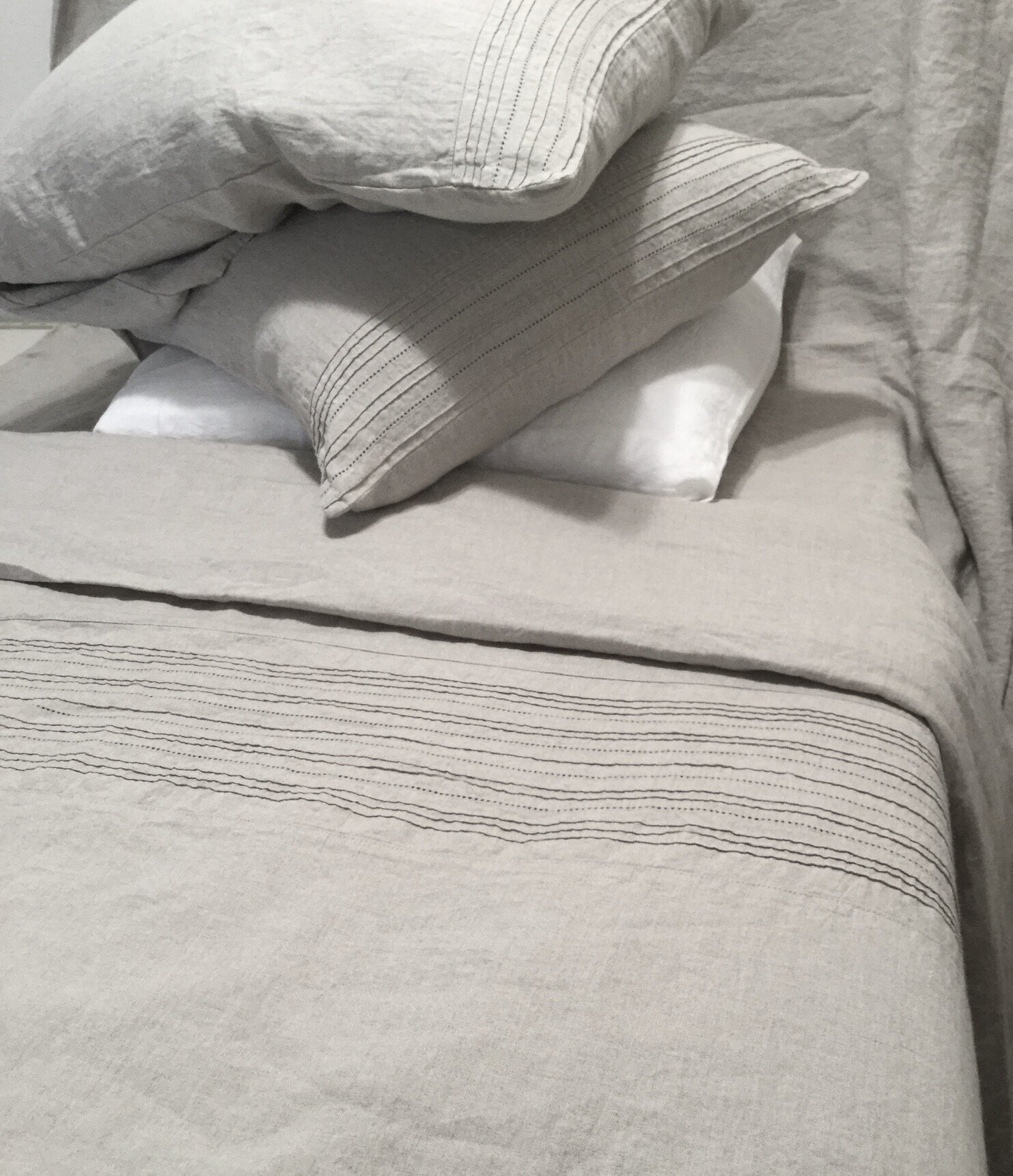
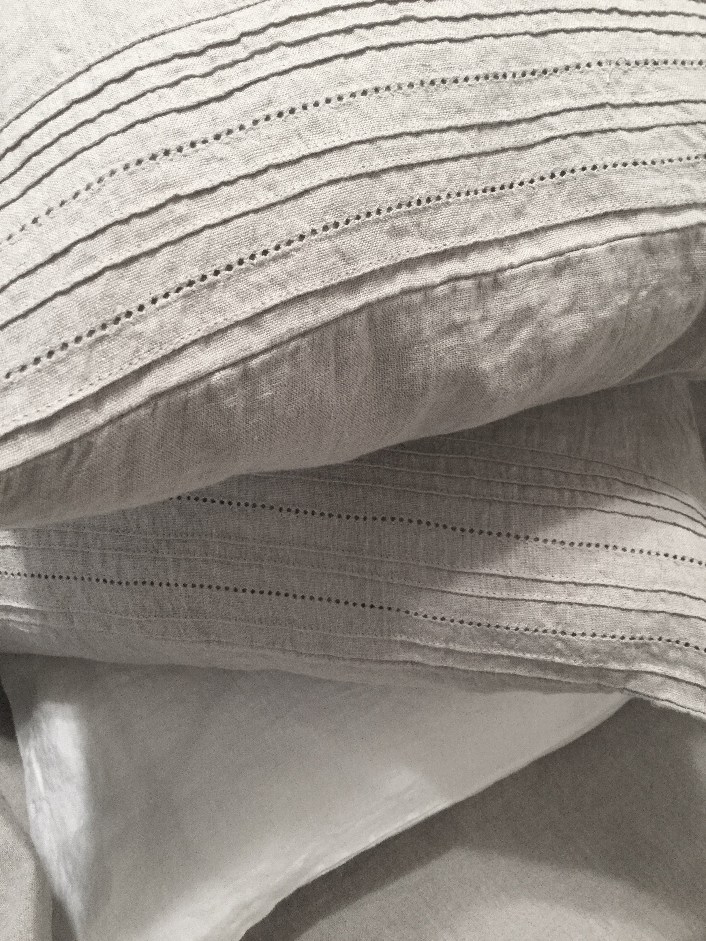
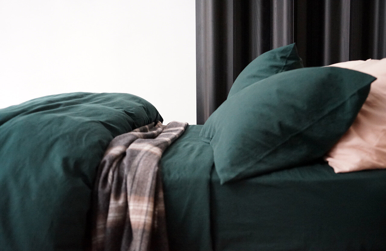
Made in Portugal, 100% washed cotton, dyed in small batches, giving AREA’s Perla sheets a mega relaxed, subtly wrinkled linen kind of vibe, which is especially forgiving if the idea of ironing your sheets makes you break out in hives from head to toe. And if you’re not so keen on making your bed every morning? Maybe not such a problem, as they still seem Instagram-worthy, even in a rumpled, post-sleep state. Sold as individual flat or fitted sheets, sets, cases, and Available in a wonderful color range: Celeste, Porcelain, Slate, White, Powder, Plant, and Honey.

Matouk’s Ceylon Satin Stitch
 
Matouk Ceylon Satin Stitch.png
 

A subtle hint of a sheen, a super sumptuous feel (thanks to its 520-thread count), and only available in two colors – white and ivory – Matouk’s Ceylon Satin Stitch is perfect for the diehard club of all-white linen lovers (of which we know many!). The satin stitch edging gives these classic white sheets (made in the United States of cotton imported from India) an extra oomph of refinement.

For the love of sage

If you’re from the Northeast, in particular, you’re quite possibly familiar with Vermont’s penultimate old-school, traditional glass and pottery maker and purveyor, Simon Pearce. Their trademark celadon crackle glaze was popular seemingly from the first moment of its inception and continues to garner such fervor and admiration even today, whether it’s on bowls, lamps, plates, or pitchers. There are collectors who quite simply cannot get enough of celadon crackle Simon Pearce pottery.

The color itself, however - that somewhat ineffable hybrid of sage, celery, mint, and pistachio - has waxed and waned in its popularity throughout the years in regards to interiors and design, tableware, tile, lighting, fashion, and furniture. Versions of it pop up in Saarinen and Eames furniture, Warhol’s soup can prints, and in Hitchcock’s “The Birds,” an “eau de nil” light green suit is worn by the Tippi Hedren as she flees the maniacal flocks. (You can read a fascinating piece on “eau de nil” and its omnipresence throughout the ages right here.)


Recently, we started a fantastic project in Malibu, a small but incredibly precious jewel of a spot by the sea (#projecttheskyismoreblueinmalibu on Instagram) and immediately noticed our client’s affinity for this sage-y/celadon-ish/eau de nil color - it’s on their living room, kitchen, and dining room walls (the collective space encompasses all three of these rooms, to be fair) and in some of their displayed ceramics, as well. The home is literally atop the Pacific Ocean, so the idea of putting any sort of blue on the walls seems redundant and destined for failure - I mean, how do you compete with the myriad versions of blue offered up by the Pacific Ocean? You don’t.

But we didn’t stay wholly committed to sage/celadon/mint-green, either. Ultimately, we went with our favorite “warm but fresh” white, Benjamin Moore’s Simply White, for the living room, kitchen, and dining room walls, but we wanted to give our fabulously ready-for-change client some sort of sage . . . somewhere. Especially because when you’re in the midst of a complete re-do remodel, you don’t want to ever feel like you’re pushing a client so far out of their comfort zone that they’re a stranger to themselves and the final reveal of the home feels like an unknowable environment they’re forced to reside within. It’s a balance of creating entirely new spaces with new elements, colors, energies, lighting, textiles, art, and furniture, and doing so with the clients’ truest natures being respected, revered, and reflected in the unexpected and wonderful newness.

And so, here we are, right now, with a Malibu bathroom fated-to-be-painted in Farrow and Ball’s Green Blue and we’re currently cooking up some ways we can bring some sage-y celadon into their kitchen cabinetry. We’re currently keeping it in our back pocket - because a bit of this pale green goes a long, long way, baby, whether it veers towards celery, serpentine, jade, or minty fresh.

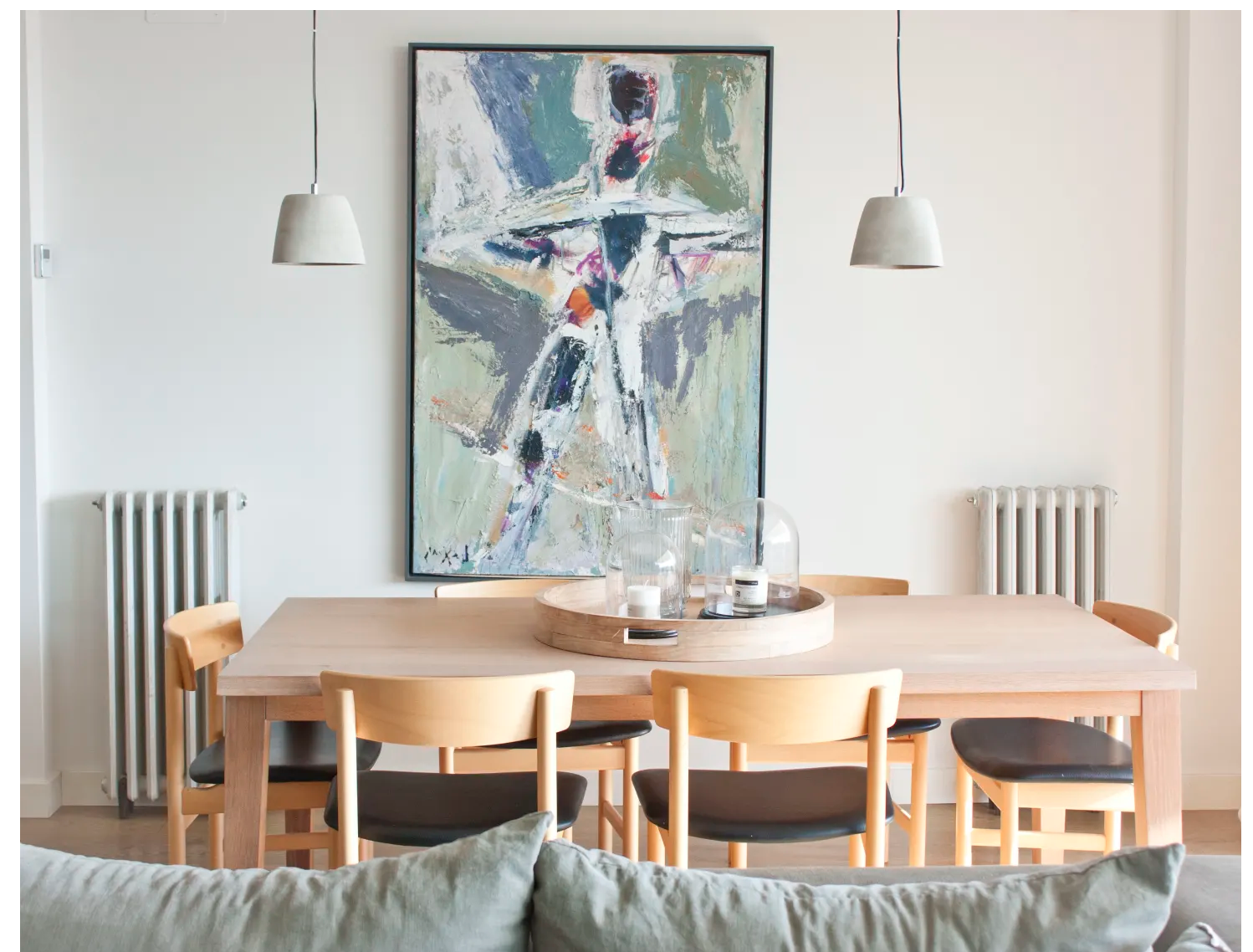
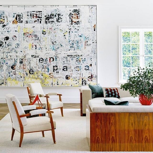
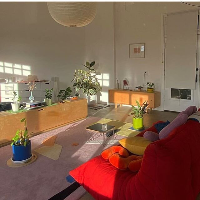
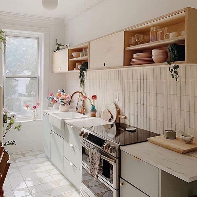
Since we took a dive into the world of sage and found some amazing things while doing so (like incredible cement sinks , The Road to Todos Santos paint, and deliriously delicious settees, for example), we’re sharing some of this sage-y beauty with you! All for the love of sage. Enjoy!

Studio Ashby, London penthouse.

Studio Ashby, London penthouse.

Jimi Sofa, made in Spain; 1stdibs

Jimi Sofa, made in Spain; 1stdibs

Designer Matilda Goad’s U.K. home

Designer Matilda Goad’s U.K. home

Carolina Mariana Rodriguez, Apartment Therapy

Carolina Mariana Rodriguez, Apartment Therapy

Thonet Targa 2-seat sofa by GamFraseti

Thonet Targa 2-seat sofa by GamFraseti

ASKA’s Maria NIla Salon

ASKA’s Maria NIla Salon

Leo Bruno Todd painting

Leo Bruno Todd painting

Concretti Designs concrete sink (in Pistachio)

Concretti Designs concrete sink (in Pistachio)

Sandra Relagado’s Barcelona home, Apartment Therapy

Sandra Relagado’s Barcelona home, Apartment Therapy

Architects EAT, Melbourne, Australia

Architects EAT, Melbourne, Australia


Designers Advise The First-Timers

Beginning a relationship with an interior designer or architect can be a bit like dating. There’s a particular vibe you get from the other person and you innately determine whether or not you want to see them again. And then again. And then again and again.

Well, let’s be realistic. It’s actually way more complicated than dating.
Way.
More.
Complicated.

Fold in the intimacies and private nature of your home and its residents, its possessions, its pets, your lifestyle, your predetermined and sometimes latently truculent beliefs about the kind of home you *think* you want and the path to arrive there. Then fold in the potential for a proprietary claim on the space you, deep in the recesses of your soul really do want changed. Then fold in the psychology of trust, money, and a healthy dose of fear. And, yes, without a single doubt, this venture has the very real capacity to be significantly more complex than mere dinners, movies, cocktails, and whatever else falls into the broad category of modern “dating.”

The past year has brought a lot of first-timers to the interior design realm, particularly after a year of really getting to know (read: forced to become extremely familiar with) the interiors of their homes, as well as some first-timers who’ve bought new homes and need an expert eye straightaway.

With the proliferation of first-timers who may be nervously entering the interior design or architect process and relationship (because while it may not be dating, it is indeed a relationship!), we thought we’d consult with some of our favorite esteemed designers and architects for their wisdom, and throw in a bit of our own advice for the nervous newbies for good measure!

Design by Lily Spindle, photo by Michele Thomas

Design by Lily Spindle, photo by Michele Thomas

1) “Always do your research.”

Kirsten Blazek, the wildly talented mastermind behind a1000xbetter, an interior design and home staging company launched in 2014 who now offers online virtual design in addition to commercial and residential design (as well as real estate staging!), points out it’s best to calm your nerves by doing your due diligence beforehand.

"Always do your research. Find a designer that aligns with YOU as a person and your aesthetic. Anything having to do with your home is an intimate process. You're involved in each other's lives for a long time so make sure you vibe and the connection is organic. I think asking a lot of questions is always beneficial. You'll navigate things a lot smoother with transparency. Lastly, be open.”

Design by a1000xbetter

Design by a1000xbetter

2) “Establish a preliminary budget range.”

Blazek emphatically states “Establish a budget from the start!!! Make sure you can afford the designers you meet with. Money can be a sore subject and our goal is to work within the clients' means.” She’s right to add all those exclamation points because while money can seem sort of nebulous and loose at the start, it’s certainly not nebulous once the invoices begin to roll in.

Su Addison and Jefferson Schierbeek, the duo who make the Addison Schierbeek architecture firm everything that it is – intuitive, collaborative, and downright brilliant – say, “when embarking on the adventure of a remodel or construction of a new home, be prepared to ask a lot of questions about the process and answer a lot of questions about yourself. Start with a little soul-searching and consider what you want. Establish a preliminary budget range for the project and desired timeframe.”

Design by Addison Schierbeek. photo by Michele Thomas

Design by Addison Schierbeek. photo by Michele Thomas

“Break the habit of looking at a room piece by piece, and definitely stop looking at the budget that way, too,” says Patrick J. Hamilton of Manhattan-based Patrick James Hamilton Designs. “I’ve had clients say, ‘Oh, I’d never spend that much on a lamp!’ even though they absolutely loved it. But if you look at the room, and its budget, in totality, your designer can make that lamp work, and still bring you in at or under budget.” An interior designer, blogger, and writer, who’s clever, talented, hilarious, and whose work is beyond elegant, Hamilton’s perspective has been honed by over a decade’s worth of residential projects in New York and his brilliant advice for the first-timers hit home with us.

Design by Patrick James Hamilton Designs, photo by Jody Kivot

Design by Patrick James Hamilton Designs, photo by Jody Kivot

3) “It’s a process that will seem longer than you’re expecting.”

Thanks to the miracles of television production and editing, it seems like on a budget of eight dollars, two tubes of Superglue, and 72 hours, intrepid designers can create a new bathroom/kitchen/ADU. Sorry, y’all. Even the best of us are stymied by those parameters. The interior design process is indeed a process – it’s not immediate and it can’t quite be rushed, unless you’re prepared for results that could very well feel disjointed and fragmentary.

As Hamilton says, “Be prepared for an organic process, and a process that will seem longer than you’re expecting. It’s definitely not ‘as seen on TV.’ Respect the process. We all work a little bit differently, but we all have our own tried-and-true process for getting to a fully finished room. The early days of the project may seem slow, but that’s when the groundwork is really being laid.”

Carly Callahan, owner and head designer at Callahan Interiors, based in Chicago, brings straight talk to the table on this bit of advice: “Expect hiccups. No project runs smoothly from start to finish . . . Be prepared for an issue (or five) to arise and be open to solving them together with your designer. It could be that a fabric that you love is discontinued, the perfect slab for your countertop broke in transit, or the wood floor stain came out totally different than the sample you selected.” Callahan, whose interiors are predominantly bright and fresh, with soft, nuanced hues throughout continues, “Sometimes this results in what I call “happy accidents” and can even end up being the best part of a project.”

Design by Carly Callahan

Design by Carly Callahan

4) “Trust your designer.”

We fully understand that your home is, for all intents and purposes, not just your haven but an extension of yourself, so when bringing interior designers into your space triggers the specters of territoriality to emerge, we aren’t exactly surprised. But, as George Michael used to say, you gotta have faith. We see things you don’t see, we see a wider, more aerial, holistic perspective and the myriad possibilities of beauty.

“It’s definitely a process of learning to trust your designer,” says Hamilton. “The earlier you jump in with the trust, the better the outcome will be. We have incredible visualization skills. It always makes me laugh when a client says, “I just can’t see that” as a reason to shoot something down. Well, I can. That’s what you’re paying me for.”

Blazek agrees: “It's hard for people to fully trust in a designer, but usually the best work comes from that trust.” And Callahan echoes that sentiment: “This is what we do for a living and our goal is to make you happy. We can achieve the best results when we have a client that trusts our vision and expertise so it's truly in your best interest to find someone you can put that trust into.”

Design by a1000xbetter

Design by a1000xbetter

5) “Let them take you beyond your comfort zone.”

“Be realistic about what leaps of faith you’re ready to take,” says Hamilton. “I worked with a first-time client who said that she was really ready to reinvent the space (after a flood in an adjacent apartment gave her insurance money for a whole-apartment renovation). It turned out she wasn’t, and slowly but surely, the whole thing eroded back to exactly what she started with, right back to the comfort zone of how she lived for the previous 20 years. It made us both frustrated, we wasted a LOT of time, I lost money, and she surely did not get her money’s worth out of the relationship.

Is this another way of saying “trust is crucial”? Perhaps. But how can you, as a first-time client, end up with a space you’ve never been able to quite imagine but one that you absolutely love? You’ve got to trust the interior designer and/or architect ultimately aims to get you there. That’s our mission. None of us want to recreate what you already have and keep you locked into a space that initially made you reach out to us in the desires for much-needed change to begin with. Bringing you back to where you started is NOT our goal. Where’s the joy in that experience? Where’s the fulfillment in that big reveal?

Design by Carly Callahan

Design by Carly Callahan

“Understand that a project evolves throughout the process and can transcend all expectations when there is a strong collaboration between you and your architectural team,” adds Addison/Schierbeek. And that word – “evolves” – is crucial to recognize. Evolution is not about staying where you began – it’s about thriving, developing into something new, something unexpected. Let your designer bring you there! It’s a good place to be.

6) “Work your YES muscle.”

We’ll add this final tip: while the interior designer/client relationship involves compulsory trust in order to make the creative venture a truly successful one, and a predisposed love for the designers’ work is also vital, the interior design experience is an excellent opportunity to work your “YES” muscle. The “NO” muscle can be Herculean in certain respects and some first-time clients have that “NO” muscle bulging and glistening, doing “NO” reps - curtly declining palette proposals, rugs, tiles, sofa styles, upholstery options, kitchen and bath layouts, floor materials, you-name-it. Those laconic NOs don’t help us, as designers, get any client any closer to where they could be. We’ve had more than a few clients tell us “I don’t know what I like, but I know what I don’t like.” With that, there’s a seemingly infinite number of things someone could reject, for a seemingly infinite number of mysterious reasons (sometimes reasons are, in fact, shared and that clarity is actually rather helpful: “I don’t like Lucite because it reminds me of my grandparents’ house in London.” OK. Noted. Also, true story.)

Design by Lily Spindle, photo by Michele Thomas

Interior designers, even those of us who’ve been in the business for years, cannot topple a craggy NO mountain. There aren’t enough design service hours in the universe. We’d suggest that first-timers work that YES muscle, because NO has been working overtime at the late night gym while YES has atrophied. Find something you like. A style of leg on a dining table, a particular fabric sheen, the proportions of a mid-century modern coffee table – just say YES. Because it gets easier and more empowering every time you say it, and your confidence in what you do like will only expand, which will, in turn, impact the final outcome of the project as much as it will impact the conditions of the countless roads we take to arrive there.

Lily Spindle in DOMINO Magazine

For anyone who’s ever gone through a remodel, is in the midst of a remodel, or simply scrolled through Instagram perusing the countless remodels to be discovered, you know the design devil is in the details. And fewer places unabashedly reveal that inescapable reality than the kitchen, where so many things can go wrong, mismeasurements made, the best of pragmatism and planning potentially falling short. With remodels becoming more constant and price tags becoming more costly, having a trustworthy and clever guide to facilitate the process is muy importante and if you’ve had the luxury of our co-founder Debra Vigna serving that role, you are a seriously lucky human.

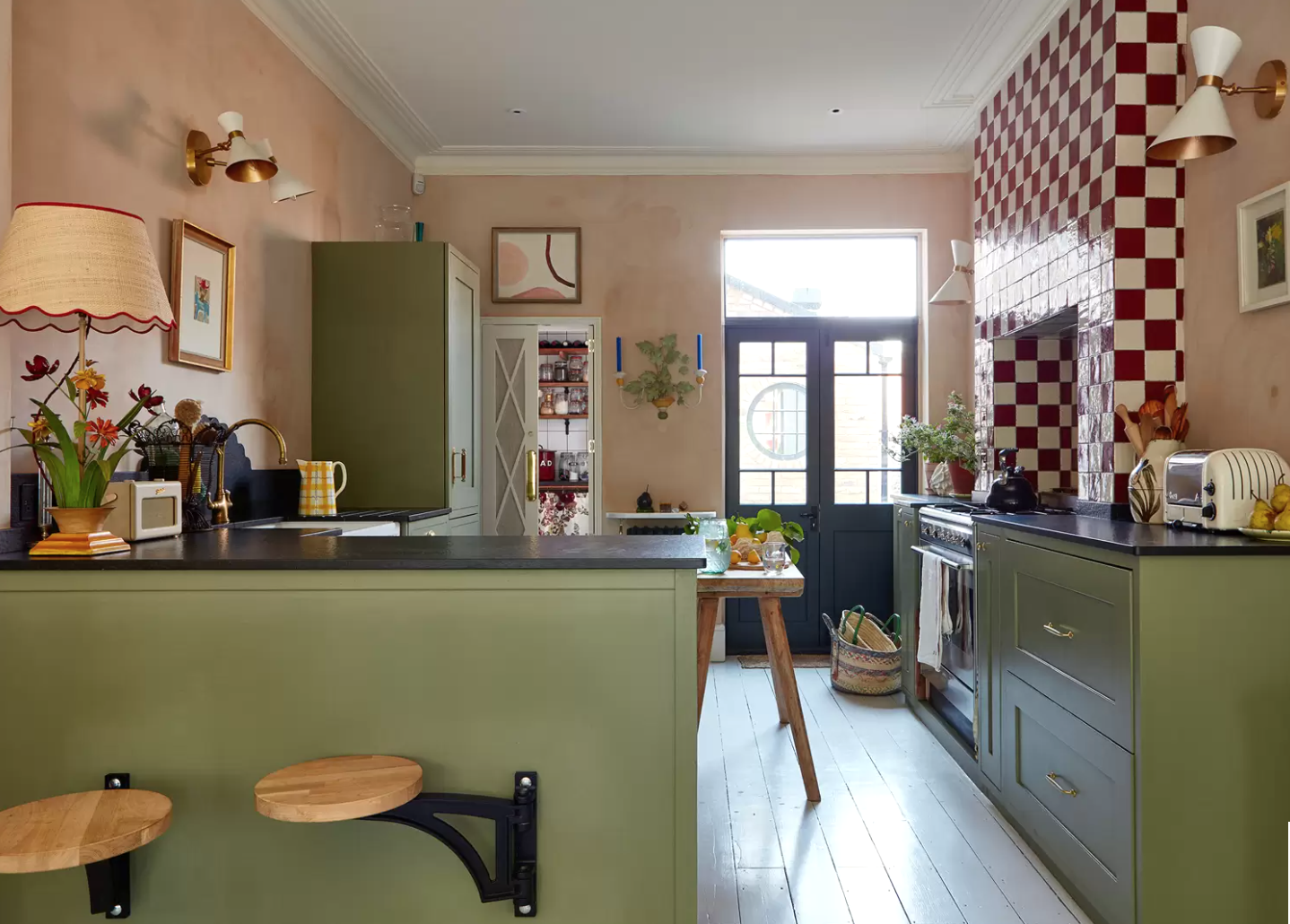
DOMINO magazine recognized her infinite wisdom and creative strategies when it comes to kitchen design and included loads of her tips in their piece “A Pro Guide to Choosing IKEA Kitchen Cabinets.” Case in point, among other kernels of tasty wisdom, “When it comes to assembling and installing IKEA kitchen cabinets, the general consensus is: If you consider yourself a handy person and can carry a toolbox with the best of ’em, go for it and more power (tools) to you! If not, chalk up an installation service cost as money well spent—and grief well saved. ‘It’s definitely tricky,’ says Vigna, who recommends working with an installer. Having an expert who can respond in real time to unexpected roadblocks is valuable. ‘Someone with good carpentry skills gives you more options than you’d think,’ she notes.

‘Hiring an installer may add another 5 to 8 percent cost to your project bottom line,’ continues Vigna. ‘But when 50 IKEA boxes arrive and you don’t know what they are or where they go, it’s such a lifesaver to have someone come in and put it all together in a day.’

Picking The Best Exterior Paint Colors - LS weighs in on Redfin

It’s one of the most common subjects we talk about with clients and a series of question we’re asked by many, many people struggling to find the golden calf of the design deities and paint gods - the right paint color, the right paint finish, the right combination of hues throughout a home’s interior spaces, and the right colors on the exterior of a house, as well. It can be paralyzing for most people. And when they say “You know what, let’s just paint it white and make it easy,” we want to cry laughing because holy smokes, there are hundreds upon hundreds of versions of white paint with varying depths, undertones, ranges of warmth and brightness, and they each change within every space, as the natural light comes and goes, so experiencing them within the actual space(s) is pretty vital to the selection process. Additionally, every manufacturer has its own specific color formula (which is, perhaps, why attempting to create a duplicate of your fave Farrow and Ball using Behr will never quite work, sorry to say) so no two white paints will ever be identical, really and truly.

Anyhow, the long and short of it is that PAINT-PICKING CAN BE PARALYZING, so when Redfin asked us to share a sliver of our expertise regarding “picking the best exterior paint colors for your home” to share with their readers, we were more than happy to oblige. Check out our tip via this link . . . the pics included here should clue you in. ;)

EXPERT ADVICE FOR PICKING THE BEST EXTERIOR PAINT COLOR

“Whether you’re ready to tackle an entire upgrade or doing your due diligence before embarking on an exterior paint project, Redfin reached out to us and other paint color experts from Anaheim, CA, to Washington, D.C. to share our best advice to help guide you through picking the best exterior paint colors that you – and your neighbors – will love.”

Finding Calm in Chaos - Goodbye 2020, Hello 2021

Finding Calm in Chaos - Goodbye 2020, Hello 2021

Holy smokes, we made it. We made it to 2021. We crossed the threshold from 2020 into a new year. And we know it’s all been a pretty rocky ride to get to this moment. It’s been horrific and frightening and endlessly shocking, but also abrim with hope, change, community, beauty, and a consistent, indefatigable drive to imagine and strive towards a new day, a new dawn . . .

Creating and Clearing Spaces

There’s an incredible feeling of lightness awaiting you when you’ve finally, at long last, tackled a task you’ve emotionally and psychologically belabored the hell out of and procrastinated over for so long you most likely ceased to recognize the dread and heaviness dragging you down every single time you walked into that room, passed that corner, put your make-up on in front of that mirror, or woke up feeling inexplicably anxious, unrested, and off-kilter and just continued on with your life, regardless.