los angeles

SHAPERS /// KELLY NEWFIELD, Founder of DRESSMAKER + VOLUNTEER

Kelly Newfield is an artist, clothing designer, creator of bespoke cushions, and loving momma to Vida and Clara, two sweet old lady pit bulls, in no particular order of importance. Because Los Angeles animal rescue is essentially a massive Venn diagram and we're basically six degrees  removed from "that overweight black lab relinquished at South LA Shelter" (specific shelter dog reference subject to change), we frequently cross paths with others sharing our obsessions for all wonderful things dog and design. Naturally, Kelly's newest creative project, Dressmaker - designing and producing hand-dyed, cut, and sewn one-of-a-kind luxury pillows, immediately had us both intrigued and salivating like lunatics because we want ALL THE DRESSMAKER THINGS, people. 

Kelly graciously took a few moments away from creating her stunning, sophisticated pillows in her Pomona studio to divulge what's currently on her nightstand, how we can live a beautiful life with our dogs, and her theory on "trends." Thank you so much, Kelly, for agreeing to be a part of our ongoing SHAPERS profiles featuring extraordinary doers and makers ! We dig you and all your gorgeous textile ingenuity.

unnamed.jpg

Were you the kid always stitching up awesome outfits for yourself and your friends? How did you transition from clothing to home decor/pillows? Do you feel there's a comprehensive overlap of these two types of couture craftsmanship?

I did start altering my clothing from an early age, I think out of a need to create and self-express.  The cushion project came about out of necessity (as most things do).  I made some velveteen cushions for my living room, and thought, I like these, maybe someone else would like these, too.  Also the idea of being able to experiment with textiles, without the limitations that come with clothing (wearable colors, sizes, etc)…is very appealing.  Craft, quality and integrity of design are profoundly important to me.  Making things one at a time, slowly and thoughtfully.   Designing and making things has always been therapeutic for me.  It doesn't really matter what it is; a dress, a room, a meal, a garden.  I have this irritating habit of redesigning (in my head, of course) the front yards of the houses that I drive past in my neighborhood.  


       Just a coupla' cute old ladies from Los Angeles' animal shelters, enjoying their best lives. 

       Just a coupla' cute old ladies from Los Angeles' animal shelters, enjoying their best lives. 


As a dog momma, what's your advice to people who feel like they "can't have nice things" because they have a dog?  

Adopt adult dogs, and set boundaries.  Never give a new dog the run of the house, let them earn their privileges  Dogs are smart, they’ll get it quickly if it’s presented clearly.  

Also, being somewhat flexible (about everything, really) is helpful.  Don’t get upset if someone vomits on the rug, or sneezes on a freshly painted wall, just deal with it and move on.

                                                                 It's a beautiful li…

                                                                 It's a beautiful life. 


Are you a morning person or a night owl?

Night owl but I've had to adapt.  My husband makes breakfast for the dogs.  It’s best (for everyone!) if no one tries to communicate anything important to me before 8am. 


What's on your bedside table right now?

Other Minds: The Octopus, the Sea and the Deep Origins of Consciousness, by Peter Godfrey-Smith, Being a Beast: Adventures Across the Species Divide, by Charles Foster, and The Developing Genome by David S. Moore.  I am fortunate that my husband  brings home a stream of fascinating books.


Name your three favorite textile colors. 

I favor cool, moody colors, my working colors could be considered a “bruise” palette: combinations of weird greens, chartreuse, blue violet, greys from dove to charcoal, and of course black.

HipstamaticPhoto-534924590.988222.jpeg

Do you foresee any particular, imminent trends in the home decor industry? 

I go out of my way to avoid trends. Even the word “trend” bothers me, and don’t even get me started on “trending”.  I am happiest when the things that I like (Victorian, Spanish Revival) are not in style and I can find them easily and marked-down in the antique shops.  The same goes for designing clothing.  Ideas will naturally evolve from season to season.  Try to incorporate trends and you will quickly lose your way and your own vision.


MORE KELLY SCOOP: I am from Los Angeles.  My husband and I moved from Mid-city LA to a historic home in Pomona, Ca a few years ago to be closer to his professor job at Pitzer College in Claremont. I went to art school and am mostly self-taught as far as clothing design.  I have been designing, manufacturing, and selling wholesale to specialty boutiques and better department stores for 25 years – mostly women's clothing, and mostly for my own label.  My current label for clothing is Volunteer, although lately I have been focusing more on the cushions, and working on restoring/furnishing/painting our old house.  My 98 year old mother also lives with us.   I have been involved with animal rescue in LA for the past 15 years and we have two seniors, Vida (from East Valley Shelter) and Clara (Inland Valley Humane Society).  My girls share my workspace. They are sweet and hilarious and good at reminding me daily about what is actually important.


*Lily Spindle's SHAPERS profiles the people whom we consider to be remarkable movers and shakers, doers and dreamers, trailblazers and big thinkers, the people who are doing things a little bit differently and unconventionally, with immense heart, passion, and authenticity. Artists, designers, writers, philanthropists, iconoclasts, artisans, heroines, voyagers, and all kinds of extraordinary extraordinaires will be interviewed in our SHAPERS series.

It's that time of year again, y'all. It's Punchlines for Paws!

Here's some mid-March musings for you lovely creatures! 

First of all, we're pumped the sun has come out again here in Los Angeles and, secondly, we are SUPER PUMPED for Punchlines for Paws next month! Who can resist gut-splitting laughs and adorable rescue dogs? Pretty much NO ONE. Whitney Cummings and Andy Richter will be gracing the stage, among many other funny, animal-loving folks (famous and otherwise). Crazy good silent auction items, to boot. We're talking crazy good - art, trips, jewelry, clothing, services...it's all excellent. Pssst....we'll be donating a free 2-hour in-home design consultation with, you know, US, so there's at least one thing you know you wanna bid on! All ticket and silent auction proceeds go to Home Dog LA and A Purposeful Rescue, as these two amazing (and entirely female-run) organizations have joined forces for this particular event. Buy your tickets ASAP! 

92c1dc61-52d9-4ba4-8f3b-3e2e5fa4c348.jpg

What's the psychology and pragmatism and creative discussion that results in color creation of the Pantone sort? This fascinating read on color forecasting in NY Times Magazine blew our minds. How did Pantone create 1999's Cerulean Blue? What particular pink was 2014's color of the year (you product junkies will know this, no doubt)? In what ways does color subtly communicate? Yep. Minds officially BLOWN!

Get yourself to The Broad . . . "One hopes for something resembling truth, some sense of life, even of grace, to flicker, at least, in the work." Jasper John's epic exhibition at The Broad, featuring more than 120 paintings, drawings, sculptures, and prints, is on view until May 13th. It's been described as blissful. We can all use a bit of bliss, no? Get your tickets here.
 

The Lily Spindle + Rita Earl Blackwell photoshoot

We knew it was time to recreate our website. A lot had happened with Lily Spindle in nearly three years and I was like, "jeez, my hair is so much shorter now" and Deb was like, "yeah, my hair is so much blonder now" and, of MUCH greater importance than our respective coiffures, Lily Spindle had new/different projects we wanted to share! A vital element of the reboot was in finding a photographer in Los Angeles who was able to snap photographs of us, our dogs, and us WITH our dogs. The photographer would need to be 100% comfortable around multiple dogs of varying sizes and mixed breeds, would be able to capture the relationship of said dogs with their people, and would need to be gifted in snapping portraits in which the subject didn't appear strained or awkward (and, in my personal case, not looking like a strangely gesticulating, raging lunatic). Deb and I threw a few names around - all photographers we adore and revere, each of them gifted and talented and incredible. But one particular photographer's name kept coming up - Rita Earl Blackwell.

Here's a bit of scoop on Rita Earl Blackwell:
A native New Yorker, she's lived in Los Angeles for 25 years, but her accent is so strong people have a difficult time placing it (seriously - I overheard someone ask her if she was Australian). She says she's had a camera in her hand for as long as she can remember. A devoted animal lover and advocate (as well as a senior dog mom and hospice dog foster), Rita rescued her first dog in California back in 2006 and soon realized there was a way in which she could give back to the rescue community ("without adopting them all," she jokes). Thusly, she donates her photography services to "shelters, rescue groups, and any animal in need." Oh, and this is how gorgeous and sweet she is with the (now deceased) fur babes, Jujubee and Fiona:

unnamed.jpg

I was familiar with Rita's photography namely because I'd seen RITA EARL PHOTOGRAPHY watermarked on countless fabulous photos of adoptable dogs and cats available at various Southern California-based shelters and animal rescues (Angel City Pit Bulls among them - they're awesome!). Deb met her when Rita was photographing for Dawg Squad and Deb was handling a new Dawg Squad addition - South LA Shelter dog named Darwin (formerly Frankie). And, last month, I'd seen Rita's handiwork myself at an A Purposeful Rescue adoption event. In short, the two of us knew Rita's way with animals is truly magical. But her way with humans is pretty magical, too. Lively, carefree, enthusiastic, with what borders on Job-like patience...

Fast forward to now...and here are a few snaps from our shoot! It was madness. Hilarious madness. We were scurrying around in 4" heels and dresses, herding seven dogs (go here to see our respective crews!), sweating our chimichangas off in an oppressive heatwave, gulping champagne, and trying not to appear crazed and anything more than intentionally "dewy." Our husbands, by the way, were on hand to help handle the dogs, but mostly they sat together sipping beers, discussing art and surf. (Love you guys.)

Rita was amazing through it all.
Lovely. Joyous. Persistent. Unflappable. And every one of our dogs immediately adored her, of course. 

This fantastic woman deserves a medal.
Or some kind of shiny trophy.
Or a stone bench in Los Angeles's Grand Park extolling her gifts and altruism.

(PSSSTTTTT . . . you can contact her right here for your very own unforgettable, sweet, and hilarious photo session!)

And, as a tribute to our usual SHAPERS' q+a features, here's a lickety split rapid fire round of just a few questions:

LS: Who are your top three all-time favorite photographers?
Rita: Inspired by and in awe of: Amanda Jones, Kristie Lee, and Sophie Gamand.

LS: Are you a morning person or a night owl?
Rita: My dogs make me a morning person. ;)

LS: Could you share one special trick for getting an excellent pet portrait?
Rita: There's a few, but just one would have to be having soft + smelly treats on hand. And lots of 'em!

LS: Describe the traits of an elderly dog that makes them especially amazing. 
Rita: Their ability to chill and enjoy every minute of it. 


SHAPERS / / MEG CRANSTON

Strolling through the massive Art Los Angeles Contemporary show earlier this year, we spotted (and Instagrammed) one of Meg Cranston's incredible dog portraits and we immediately knew we had to feature her in SHAPERS. Currently the chair of the Fine Arts Department at Otis College of Art and Design, her sculpture, paintings, and video/performance work have earned her international accolades and she's exhibited at the Museum of Contemporary Art, the Neuer Aachener Kunstverein, The Getty Museum of Art, The Hammer Museum, Museum Abteiberg, Mönchengladbach, The Carnegie Museum, K21 Museum, Dusseldorf, and the ICA, London, to name just a few.

Also, she has a super cute pooch named Jenkins and began a shelter dog photography project back in the mid-2000s, which ultimately helped to increase the number of dog adoptions, and we are always and forever 100% fans of that kind of altruism and creativity! 

Many,  many thanks to Meg for so intelligently and thoughtfully tackling this SHAPERS q+a! Enjoy!  

Can you tell us about your project photographing shelter dogs back in 2008? What was the experience like, what inspired the project, what was the endgame artistically or otherwise and how did it affect you/your work?

I was looking to get a dog and spending some time on the shelter websites. I decided to try to photograph all the dogs in LA shelters over a one month period. I tried to photograph them myself but quickly realized it isn't that easy to photograph a dog. So I partnered with the various shelters to get their photographs. That was a bit tricky because it involved working with the Chief of animal control. He was suspicious at first because he had to make sure I wasn't creating an expose on the shelters but then was happy to help. The most interesting thing was the quality of the photographs from different shelters varied a lot. At one shelter, the worker taking the photographs was careful to "art direct" the images. He posed the dogs in green settings even with some fake flowers arranged. He had the dogs standing in action poses so they looked lively and happy.

Compared to other shelters ,were the dogs were photographed in cages or on leashes, those animals looked highly adoptable. That shelter in fact did have higher rates of adoptions.

Because people primarily look at shelter dogs on websites, being photogenic is a life or death issue. 

The paintings I did of the shelter dogs takes that a bit further. Historically there are many dogs in paintings though typically they are high status dogs - hunting dogs or pets of wealthy people. The paintings of George Stubbs would be an example. I decided to do rather monumental portraits of ordinary dogs - shelter dogs who would not typically be painted.

Meg Cranston, "Corgi," 2014. 

Meg Cranston, "Corgi," 2014. 


Meg + Jenkins. 

Meg + Jenkins. 

What's your favorite thing about living in California?
I like the attitude of people in California. Theyhave a relaxed confidence that's easy to be around. The artists in Los Angeles aren't freighted with a lot of rules. They do whatever they want. Europeans especially admire that. 


How does teaching art influence your own artwork?
Besides paying the bills? I love teaching because in my courses, I have to write lectures about new topics all the time. If I didn't teach I doubt I would read as much or stay as current. Also there is a part of me that's a performer. Giving lectures is a kind of performance. It's fun. Of course the students are all fantastic. I have said many times, I have never had a bad student.

Art students are the best and most interesting students one can teach.

Meg Cranston, "Poodle Mix," Installation view, Michael Janssen, Berlin, 2014

Meg Cranston, "Poodle Mix," Installation view, Michael Janssen, Berlin, 2014


Which decade resonates most poignantly with you - 1960s, 1970s, or 1980s? I admire art of the 1960's for its clarity and optimism, art of the 1970's for its intellectual rigor, art of the 1980's for its focus on recasting artistic values as political. 


Meg Cranston's "California" and "Fireplace 12" at the Hammer Museum for Made in L.A., 2012.

Meg Cranston's "California" and "Fireplace 12" at the Hammer Museum for Made in L.A., 2012.


The scariest thing you've ever done?
I do stand up comedy. That's pretty scary especially for the audience.


Are you a morning person or a night owl?
I am a night owl who has to get up at 6am. It's a dilemma.


Name three of your favorite sculptors/3-dimensional artists and use a single word to describe each.

Alberto Giacometti  -  armature
Brancusi  -   base
Franz West  -  scale


What books are currently on your bedside table?
Grand Hotel Abyss: The Lives of the Frankfurt School


*Lily Spindle’s SHAPERS profiles the people whom we consider to be remarkable movers and shakers, doers and dreamers, trailblazers and big thinkers, the people who are doing things a little bit differently and unconventionally, with immense heart, passion, and authenticity in what they do. Artists, designers, writers, philanthropists, iconoclasts, artisans, heroines, voyagers, and all kinds of extraordinary extraordinaires will be interviewed in our SHAPERS series.

Is your house holiday-ready?

It's barely Halloween and while the Fright Night masks are still on the shelves, retailers are stocking their spaces with holiday baubles, garlands, glass ornaments, and fake wreaths. It may seem crazy to launch the countdown to the holiday festivities so soon, but the celebrating, cooking, and partying of the the last few months of the year begins pretty much NOW and there's nothing like the occasion of entertaining friends and family (and co-workers, in-laws, neighbors, et al) to make you wonder aloud, perhaps gripped with a wave of coinciding panic, "IS MY HOUSE HOLIDAY-READY?"

Never fear, my dears!

Deb and I were talking the other day about how often we operate under tight deadlines with clients for one reason or another - surprise birthday party, cast and crew party, fundraising event, and the list goes on. We LOVE helping people get their homes together to not only feel like a place THEY love to be, but also a place they're proud to share with others. And sometimes all it takes is an outside well-practiced, creative perspective to bring your space to a more gorgeous place -- whether it involves additions or omissions or shifting the awesome things you already own (usually a combination of all three!), we Lily Spindle ladies thrive in the art of reinvigorating everything from a teeny room to an entire home. 

Case in point, for many months our friend Heather had been hunting for a rug to bring together her living room. So after a few conversations with her, Deb and I immediately hopped to it and scored her an awesome deep pink and apricot striped Turkish 5' x 8' rug (having told her we thought that Amalfi/Venetian pink was the right vibe).  The rug arrived within five days, she got herself the rug pad, and Heather was entirely stoked with the result. This is what she had to say about our work: "You two birds helped me conquer my carpet block within 24 hours! Your expert eyes quickly honed in on just the right textures and colors and I love my joyous living room even more now." Check it out below...

Heather's Noguchi coffee table and Eames molded plywood chairs are now fabulously moored by the colorful Turkish rug we discovered..

Heather's Noguchi coffee table and Eames molded plywood chairs are now fabulously moored by the colorful Turkish rug we discovered..


This Franklin Hills patio with an incredible view was staged and ready to roll for our client's cast and crew party and, come evening, the summer air and flickering candlelight completed the cozy scene. 

This Franklin Hills patio with an incredible view was staged and ready to roll for our client's cast and crew party and, come evening, the summer air and flickering candlelight completed the cozy scene. 


We also just wrapped up a project that took three and a half weeks from start to finish. Lily Spindle outfitted our client for an entirely new space, starting 100% from scratch and sourcing every single thing for his pied a terre from doormats to dining chairs and pretty much every conceivable thing in between! *Not-so-great iPhone snaps shown below! 


And so, DON'T FRET ABOUT THE IMMINENT HOLIDAY PARTIES + DINNERS, ok? Lily Spindle is at your service with our years of design experience. 

Need a new sofa?
Done.

Need an oversized vintage mirror in the alcove?
Copy that.

In need of an original painting?
Check.

Not even quite sure what it is that you need?
No worries! We'll sort it for you/with you/on your behalf. 

xx ~ Rebecca + Deb 

A "FULL HOUSE" IN LOS FELIZ: REVAMPING A LIVELY L.A. HOUSEHOLD

Name: Scot + Kerry Armstrong
Location: Los Feliz, California
Size: 2300-square-feet, 3-bedroom, 2-bath, 1 1/2 bath
Years lived in: 9

Located at the foot of Los Angeles'  iconic Griffith Park in sun-dappled and lovely Los Feliz is the beautiful one-story home of the Armstrong crew. An incredibly busy house just by the nature of its inhabitants -- husband, Scot, is a screenwriter/director known for, most recently, as the creator, writer, and director of the Showtime series "DICE" featuring Andrew Dice Clay, as well as  his work on "Road Trip," "The Hangover:Part II", and "Old School," while Kerry is the director of HOME DOG LA, an animal rescue intervention program, and they're parents to 9-year-old fashionista, Lake, and 5-year-old Charlie. They've got a bevy of mid-sized, fabulous rescue dogs and a corn snake, to boot. Hello, literal "full house"!

When we first walked into their home, we immediately sensed the innate energy within its walls - ebullient, mirthful, and wonderfully contagious. Most elements of the house didn't convey that innate liveliness and happiness, however. 

"WE MOVED INTO OUR HOME IN LOS FELIZ RIGHT AFTER THE BIRTH OF OUR FIRST CHILD," SAYS KERRY. "OVER THE YEARS WE ADDED ONE MORE KID AND 4 MORE DOGS! OUR KIDS WENT FROM BEING BABIES TO A 5 AND A 9 YEAR OLD AND OUR HOUSE NEEDED A GLAMOUR OVERHAUL! WE LOVE OUR HOME BUT ALL THE DECOR AND THE WALL COLORS WERE FEELING OUTDATED AND DULL . . ."

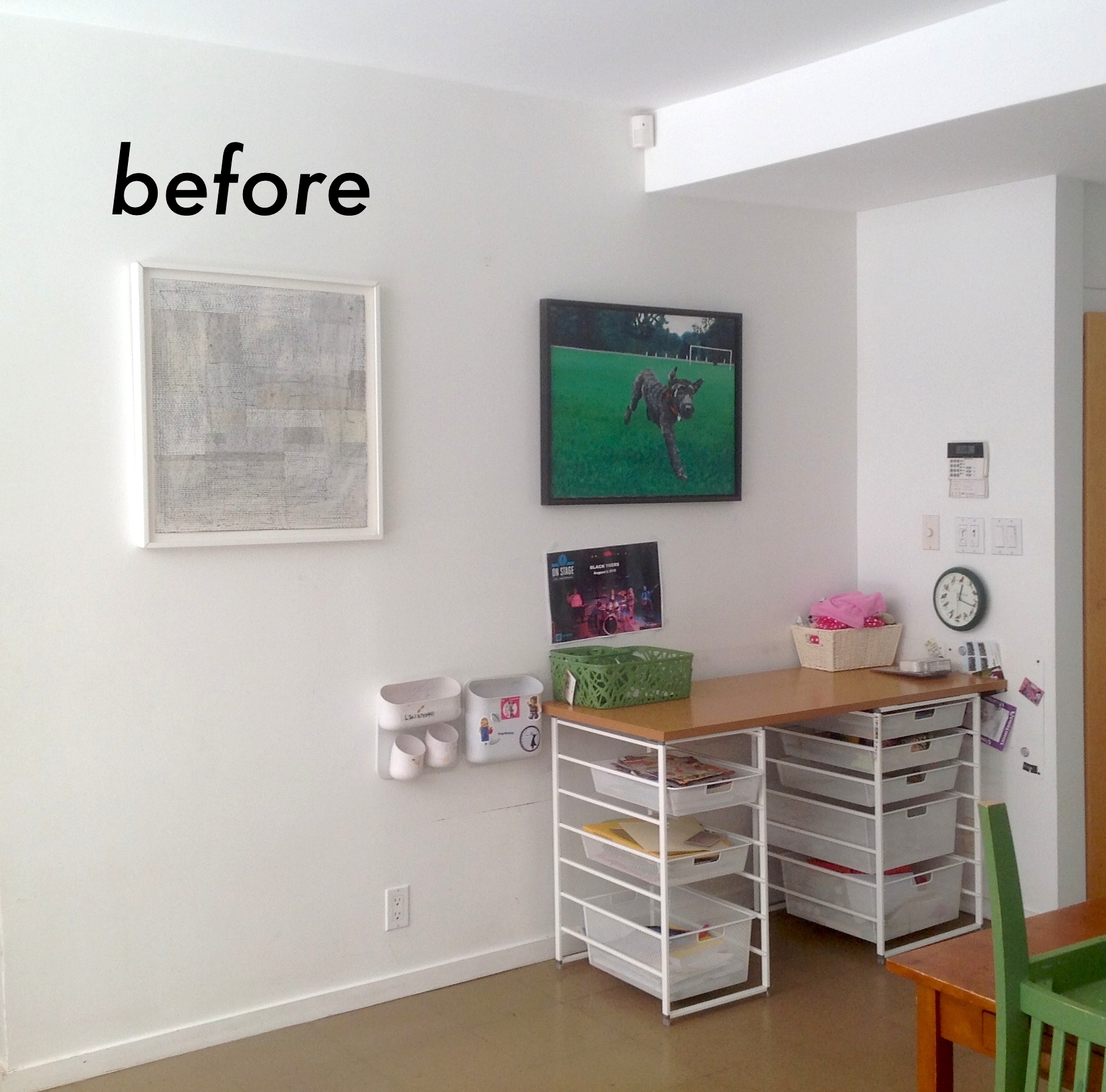
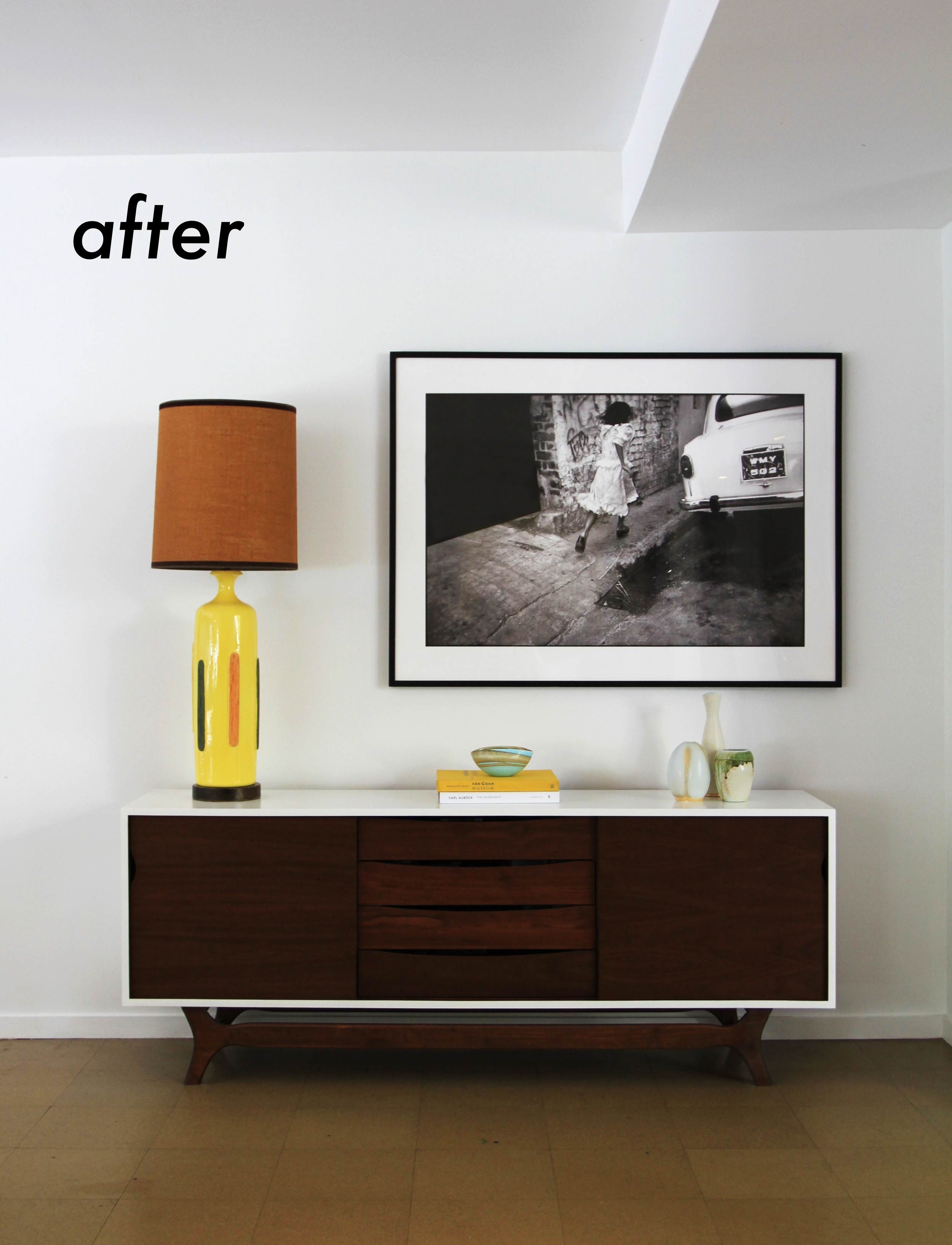
We sought to make a totally livable, 100% lovable space for this family of four and all their darling animals wherein beauty, richness, color, and light was infused into the space without becoming "precious" about anything. We felt like nothing newly introduced by us could be delicate and fragile -  in terms of textiles, accessories, and furniture, we brought in pieces that were hardy but spectacular: indigo cotton pillows and poufs, modern wool rugs, washable cotton coverlets, a variety of vintage lamps in sunny yellow and burnt sienna, a custom credenza made locally in L.A.; new paint colors for the master bedroom, den, and daughter's bedroom are bold and bright (deep azure, radiant yellow, and fuchsia, respectively) and we hung large-scale, abstract contemporary artwork from Los Angeles artists' whose work we adore, and these balanced perfectly the couple's rather substantial art collection, comprised predominantly of photography and representational paintings. 

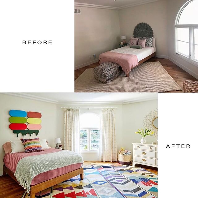
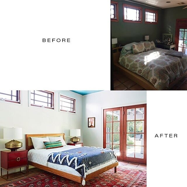
For us, the challenge was in finding that fine, ineffable balance between the utilitarian and "sturdy" to ensure that the awesome Armstrong crew gleefully and comfortably lives with the home's changes, while also making the space come to life and reflect the joyful nature of its creative and captivating people. I think (and hope!)  we succeeded! Some Before and After photos are shown below, as well as a few individual room shots. 

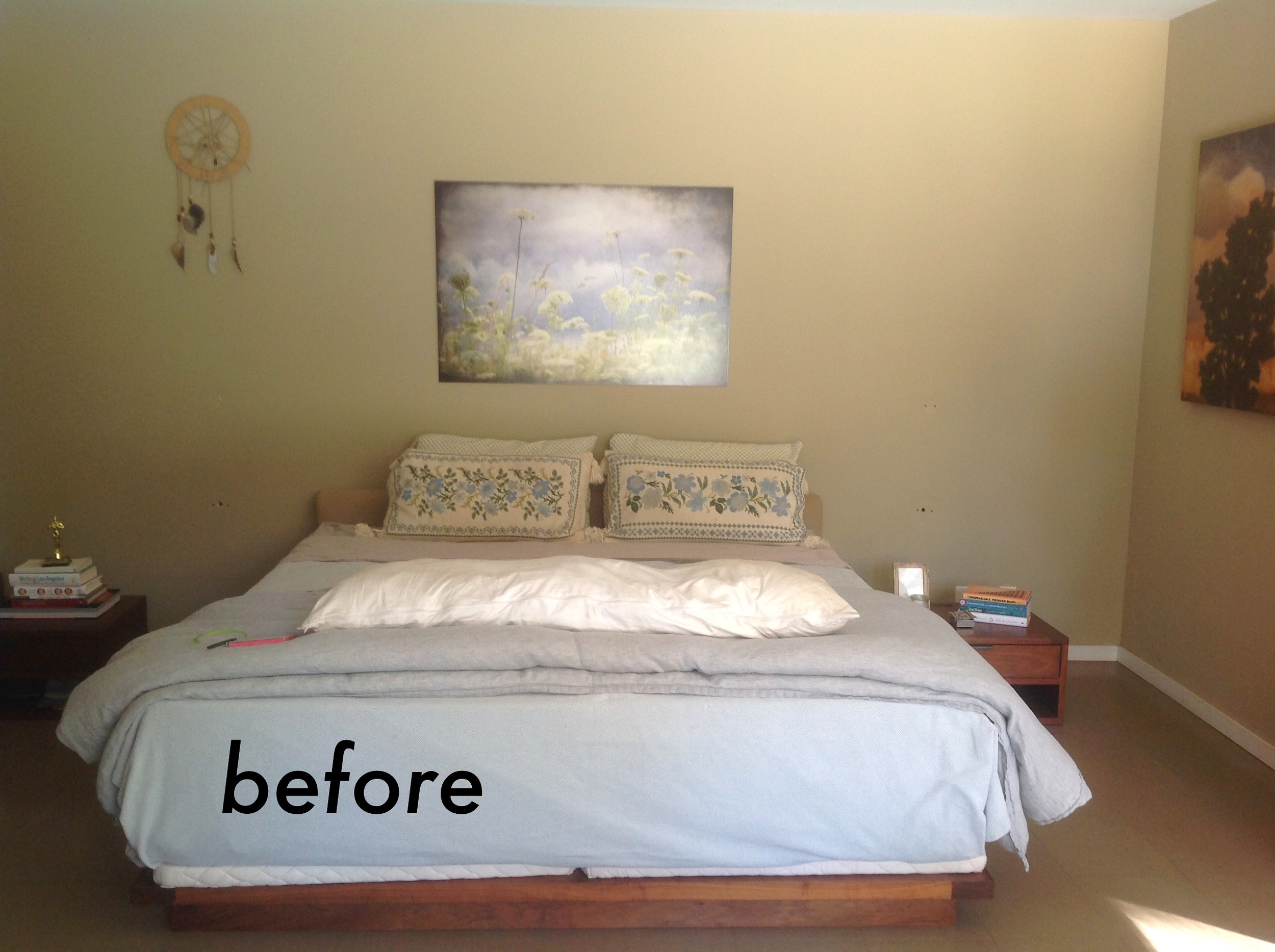
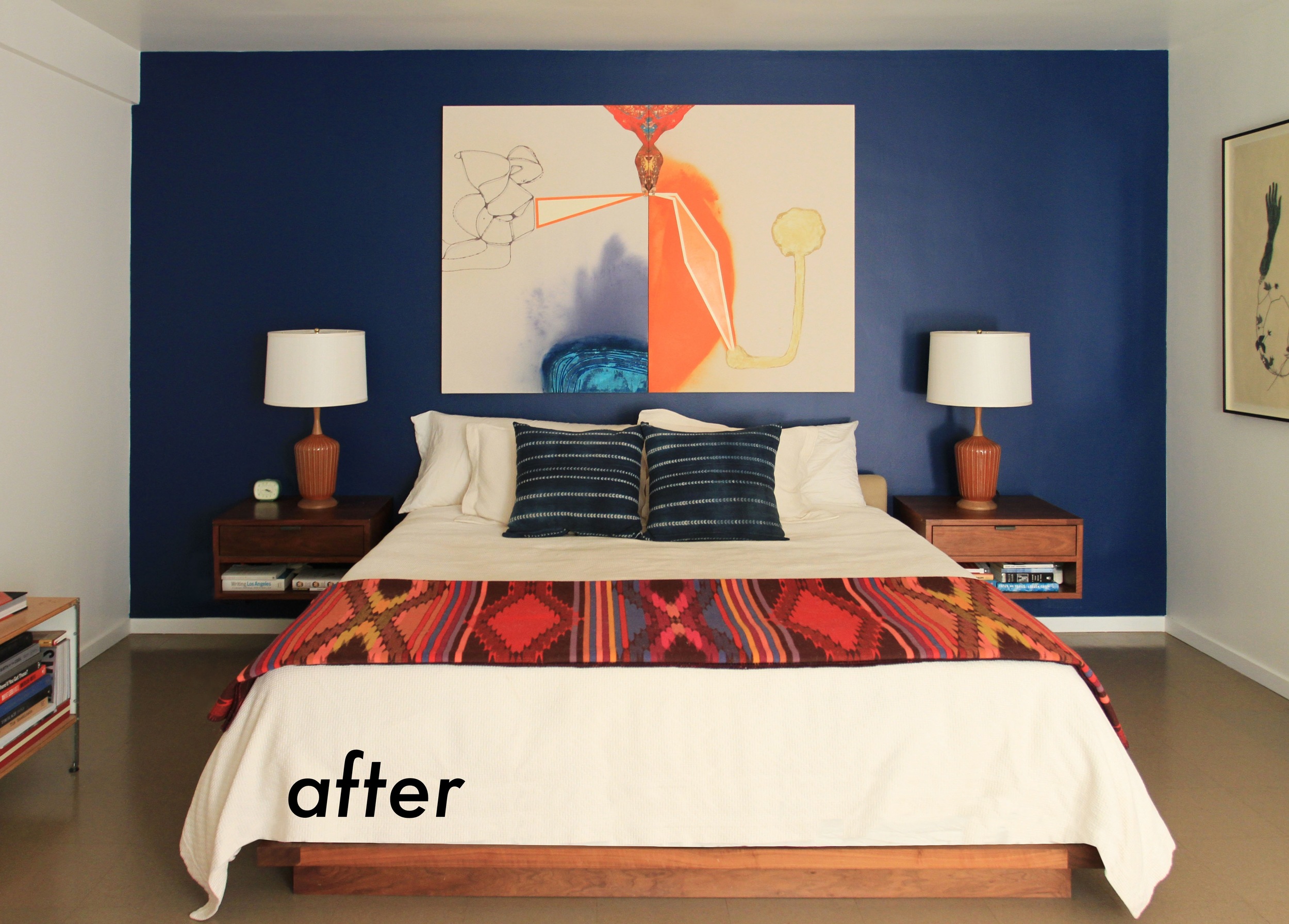
This bedroom was a combination of pale blues and dapple-greys. Totally fine, for all intents and purposes, but a bit ho-hum. We proposed something more sumptuous and deeper, a combination of vintage and new. And they were ready to do it! Wall color is Benjamin Moore's Adriatic Sea; abstract painting by Los Angeles artist David Lloyd, bedding is Pine Cone HIll and Pendleton, ceramic lamps are vintage, bed and bedside tables are clients' own. 

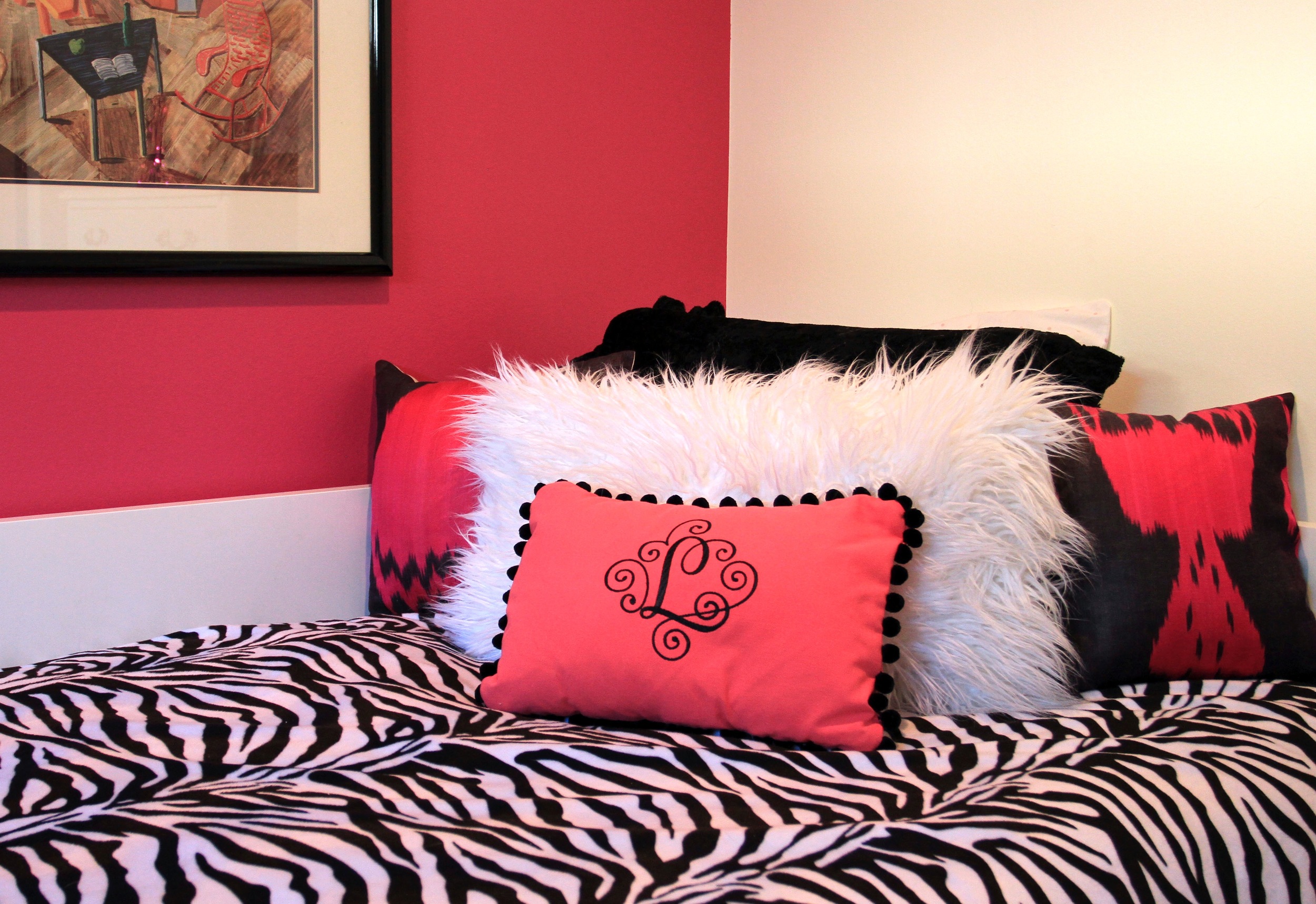
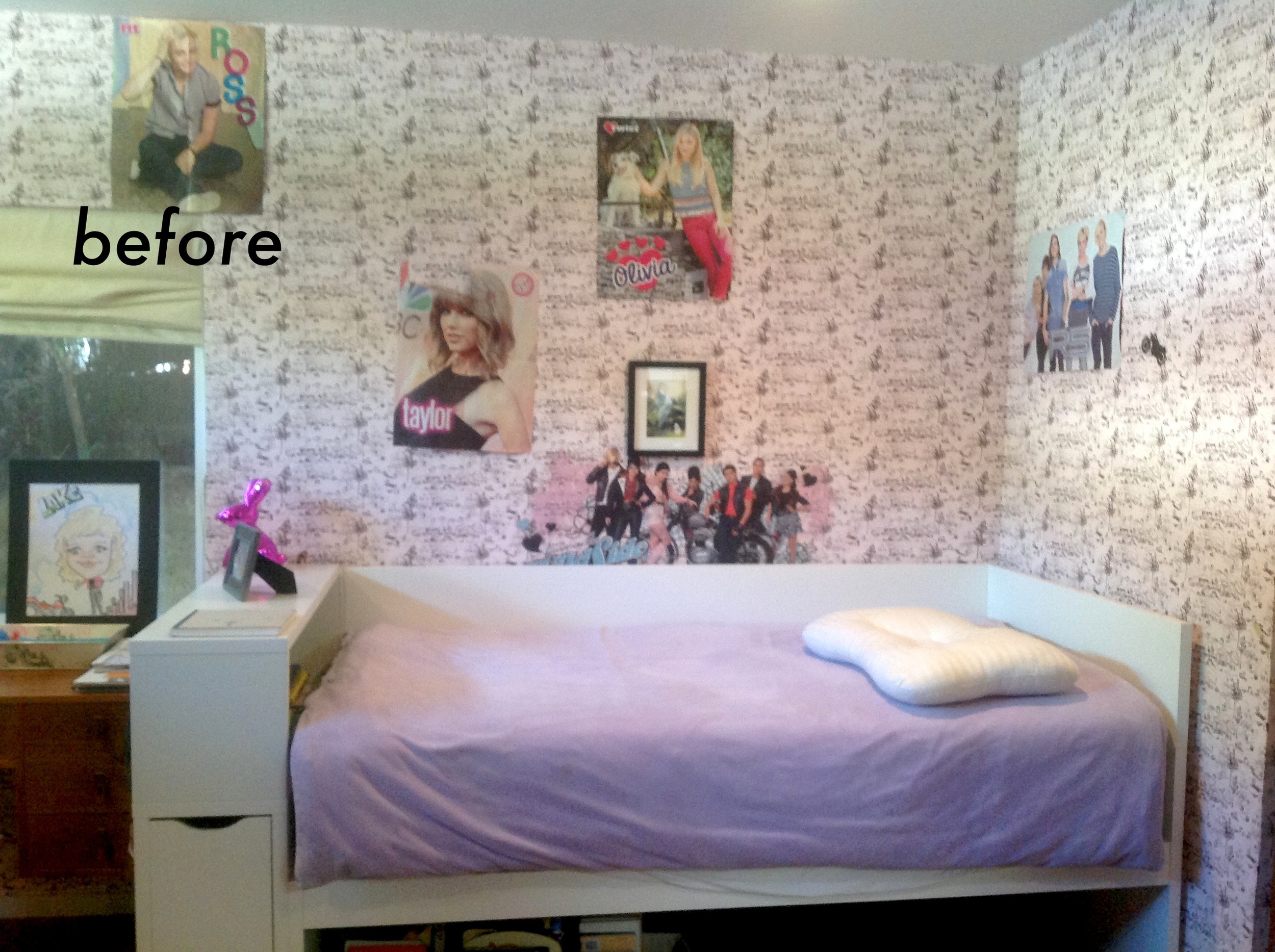
Welcome to the bedroom of a rock and roll 9-year-old. Making the transition from her childhood wallpaper and furniture wasn't without its flashes of fear, but giving her the ability to choose the paint, bedding patterns, and art from our specific proposals made this 9-year-old a part of the transformation. And it's one helluva bedroom now!  A Warhol print hangs on Benjamin Moore's Hot Lips, vintage frosted glass desk lamp, anodized aluminum trunk for costume + accessory storage, custom-made pillows and zebra print coverlet, client's own bed, desk, and desk chair. 


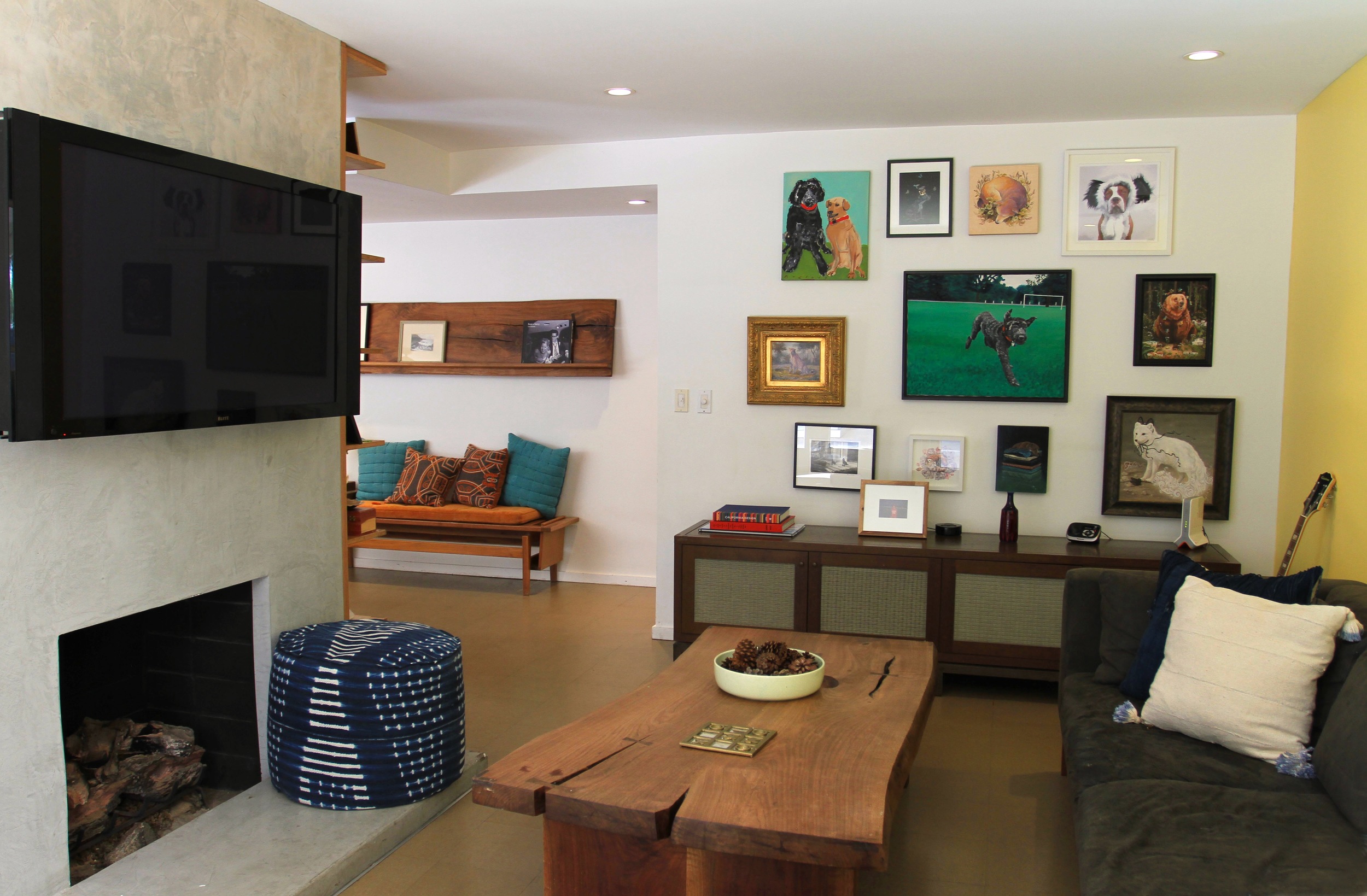
Vintage indigos paired with sunshine yellow make this den glow. Painting by LA artist Ned Evans. Wall color is Benjamin Moore Dalila. Client's own coffee table, sectional sofa, and floor lamp. 

Vintage indigos paired with sunshine yellow make this den glow. Painting by LA artist Ned Evans. Wall color is Benjamin Moore Dalila. Client's own coffee table, sectional sofa, and floor lamp. 


A salon-style assemblage of their many animalium paintings makes the den of these dog lovers even sweeter. 

A salon-style assemblage of their many animalium paintings makes the den of these dog lovers even sweeter. 


A quiet space in the front alcove, which once served as the kids' art storage space. Credenza custom-made in Los Angeles, tall bright yellow table lamp and shade are vintage, pottery by Venice ceramicist Nancy Wright, black and white photograph is client's own. 

*(Total Lily Spindle re-design non-sequitur here, but if you haven't checked out DICE, do it as soon as possible. It is damn funny + clever.)

xx - Rebecca + Deb 


The Best White Paints in the Business

Deb and I have known each other for a long time and as a natural consequence of spending many hours together, jokes have developed and insinuated themselves into our lexicon as friends and business partners. For example, I have an abiding need to throw my body into every Chesterfield sofa I encounter and every few hours, without fail, I can be relied upon to announce, "I'm hungry," and we've got to remedy that real quick or I become almost inconsolable. Also, sometimes, we show up for an art opening or similar event wearing basically the same outfit.

Recently, we were on a job site in Silver Lake and I was trying to convince a client obsessed with green paint for his home (which was already a flat, rather dark sage green and had been for nearly a decade) that a version of white was an absolutely infallible option. I actually uttered the words "a yummy white" in the midst of my persuasive speech and in my peripheral vision, felt Deb throw me a look like, "what the hell are you talking about?" Because, 9 times out of 10, as Deb is fully aware, I'm pushing for a white wall. But now I'm using the word "yummy" to make it more tantalizing. A groan and eye roll is totally justified. 

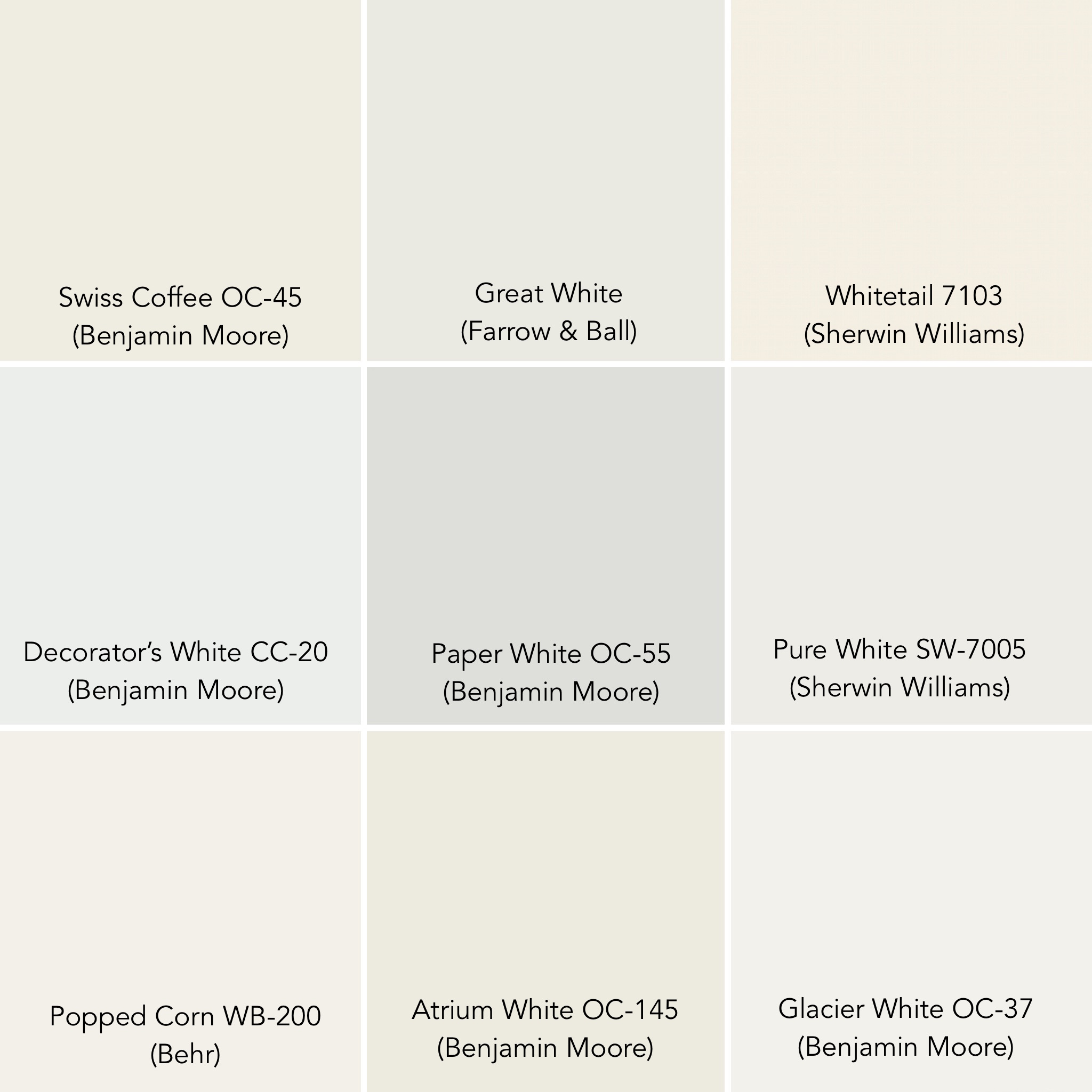
Yes, I love a white wall. I really, really do. I adore an accent wall in a bright, bold, surprising color. I admire dark, deep colors in small spaces. And I understand and honor the theory of paint color affecting your mood. But I really love white. Maybe it's because of all the art I think looks incredible against white, but it's my go-to paint color, no matter the space. My argument is that no white is exactly the same, as white, in the visual spectrum, actually reflects light and is a presence of all colors (it's science).
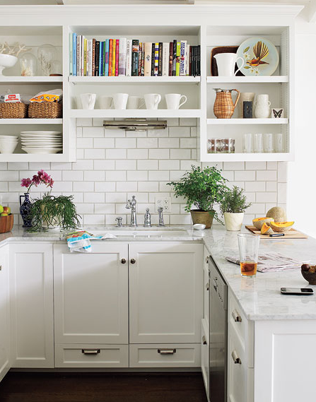
                      Some of our favorite whites pulled together as evidence - no white is exactly like any other. 

                      Some of our favorite whites pulled together as evidence - no white is exactly like any other. 

Here are five CANNOT GO WRONG WHITES::

DECORATOR'S WHITE, CC-20 (BENJAMIN MOORE) ::

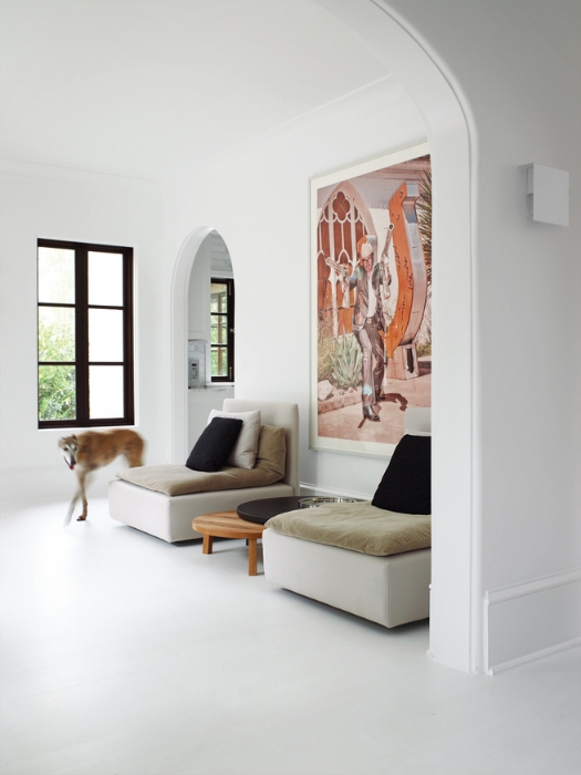
A clean, soft white that isn't too cool and isn't too warm, but always feels fresh and brings radiance to a room. 

Designer Barbara Hill used flat Benjamin Moore’s Decorators White throughout this 1920s abode in Atlanta, Georgia. DWELL magazine; photo by Gregory Miller.

Designer Barbara Hill used flat Benjamin Moore’s Decorators White throughout this 1920s abode in Atlanta, Georgia. DWELL magazine; photo by Gregory Miller.

GREAT WHITE (FARROW AND BALL) ::

One of those mercurial whites, becoming pale yellow or pink or even lilac in hue, depending upon the time of day, the slant of light, or the furnishings in the space. 

              Farrow + Ball's "Great White" (from F+B site)

              Farrow + Ball's "Great White" (from F+B site)

SWISS COFFEE (BENJAMIN MOORE) ::

This white is warm and creamy, elegant and peaceful. It's just plain ol' excellent. And not just because Veronica Mars digs it. 

Kristin Bell, her dogs, and Benjamin Moore's "Swiss Coffee" on the walls, "Simply White" on the cabinets. 

Kristin Bell, her dogs, and Benjamin Moore's "Swiss Coffee" on the walls, "Simply White" on the cabinets. 

MASCARPONE (BENJAMIN MOORE) ::

True to its delicious namesake (you see why I started calling white paint colors "yummy"?), this is a velvety, smooth, ever-so-slightly golden white. We've used it in bedrooms, living rooms, dining rooms, and bathrooms and it's equally awesome in each. 

BM Mascarpone offset by a pop of orange in the home of a digital designer, using the high chroma colors of BM's 2016 Trends Palette .Image source: Copperline

BM Mascarpone offset by a pop of orange in the home of a digital designer, using the high chroma colors of BM's 2016 Trends Palette .Image source: Copperline


PURE WHITE (SHERWIN WILLIAMS) ::

Bright and crisp, timeless white. Let's put it this way: it's part of the Pottery Barn 2016 Spring/Summer color collection. It works just as well on furniture as it does on walls and cabinets. 

Pure White cabinets make for a happy and cheerful kitchen no?Image source: Decorpad

Pure White cabinets make for a happy and cheerful kitchen no?
Image source: Decorpad


Now, I KNOW you want to know if my "yummy white" speech was convincing for the aforementioned client slightly obsessed with sage green. Stay tuned. We'll share that news in future posts! 

xx - Rebecca


Take your pleasure seriously

Last week, us Lily Spindle ladies were fortunate enough, thanks to the magnificent Lisa Chester Schroeder (read our SHAPERS profile on Lisa right here!), to get an extremely special, private, nitty gritty, anecodote-laden tour of the iconic Eames House and Studio in the Palisades. We began our day in Los Feliz doing a speedy outdoor patio installation, spent the afternoon shopping and eating in West Hollywood (Lawson Fenning and AMMO, respectively), and then drove up the respendent Pacific Coast Highway in the early hours of the evening to meet with Lisa and our wonderful guide, Catherine. Set on a bluff surrounded by eucalyptus trees, Case Study House No. 8 is an ingenious merging of work and life, as well as a brilliant collection of oddities, furniture, textiles, intimate ephemera, art, and books guaranteed to inspire you in unexpected and magical ways.

Among other tales, Catherine shared with us the story of the fragile and fantastic tumbleweed hanging from the ceiling by a string: when Ray and Charles were married in Chicago in 1941, their honeymoon-on-a-major-budget was a road trip to California to start anew. Somewhere in the Southwest, they came across this beautiful tumbleweed and popped it in the back of the car, later hanging it from the ceiling of the Case Study House No. 8, where it has remained and decayed bit by bit over time. Eventually, it will be replaced by another tumbleweed, chosen by the surviving Eames' generations and hung once again in that same place, continuing the tradition. 

The Eames House, as photographed by Julius Shulman in 1950. Photo: J. Paul Getty Trust. Julius Shulman Photography Archive, Research Library at the Getty Research Institute

The Eames House, as photographed by Julius Shulman in 1950. Photo: J. Paul Getty Trust. Julius Shulman Photography Archive, Research Library at the Getty Research Institute

While we were gazing upon the gorgeousness of the home's interior, we discussed the design trends of today, the impatience of our culture, the unfortunate myopia so often present when it comes to architecture and its relation to the natural environment. Deb commented on the books within the case, everything from high literature to "Where the Wild Things Are" and "The Little Prince," and we applauded their freedom in displaying whichever books they happened to love and revere, rather than those intended to intimidate or impress. Catherine laughed and brought us around the backside of the bookcase, where rows upon rows of Charles's softcover science fiction books were arranged. These beloved books were decidedly not given the esteemed placement of "forefront." As all couples do in shared spaces, in order to continue sharing a space, you compromise.

Interior photographs are forbidden during tours, so I'd like to defend myself in announcing this is not in fact my own photograph. Rather, it's one I've borrowed from the internet. The house and studio, including the kitchen and living room's interi…

Interior photographs are forbidden during tours, so I'd like to defend myself in announcing this is not in fact my own photograph. Rather, it's one I've borrowed from the internet. The house and studio, including the kitchen and living room's interior furnishings and details, are shown today as they existed upon Ray's death in 1988. Uncanny fact: Ray died exactly ten years to the day following Charles's death.

You can read about the history of the home/studio on the Eames Foundation site, but here's an excerpt: The Eames House, Case Study House #8, was one of roughly two dozen homes built as part of The Case Study House Program. Begun in the mid-1940s and continuing through the early 1960s, the program was spearheaded by John Entenza, the publisher of Arts and Architecture magazine . . . Charles and Ray proposed that the home they designed would be for a married couple working in design and graphic arts, whose children were no longer living at home. They wanted a home that would make no demands for itself, and would serve as a background for, as Charles would say, “life in work” and with nature as a “shock absorber."

Charles and Ray moved into the House on Christmas Eve, 1949, and lived there for the rest of their lives.  The interior, its objects and its collections remain very much the way they were in Charles and Ray’s lifetimes.  The house they created offered them a space where work, play, life, and nature co-existed.

We cannot recommend a personal visit to the mystical, gorgeous Eames house more vigorously! Take a picnic with you, sit on the grounds, and experience the enchantment and quiet power of this space. I promise you it's life-altering and absolutely worth it.

xx ~ Rebecca
 

Many, many, many thanks to Lisa for arranging this private tour for us! And huge gratitude to Catherine for spending the last hours of her work week with us and starting our weekend immersed in inspiration and beauty.

Many, many, many thanks to Lisa for arranging this private tour for us! And huge gratitude to Catherine for spending the last hours of her work week with us and starting our weekend immersed in inspiration and beauty.

There's much about this maxim that galvanizes me - turning your passion into something relevant and meaningful. And it's nearly as good as this other Eames gem: "Any time one or more things are consciously put together in a way that they can accompl…

There's much about this maxim that galvanizes me - turning your passion into something relevant and meaningful. And it's nearly as good as this other Eames gem: "Any time one or more things are consciously put together in a way that they can accomplish something better than they could have accomplished individually, this is an act of design." Hallelujah!

(sidenote: our visit did inspire a conversation about feminism - its current version, as well as the challenges that Ray no doubt faced as a five-foot-tall woman in a predominantly male world. This is another story, however, for another blog post!)